The Cude

Safeguarding intellectual property while outsourcing

One this project, I worked directly with the CTO, CEO, and the COO of Code Secure, the mother company of Cude, a blockchain advisory company. Working with a cross-sectional team, alongside a content developer, and a developer.

Summary

I established design quality benchmarks, and a continuous research practice at the company.

I led the rebranding and the renaming of the product to give it a more cohesive meaning and attributes.

I created strategy required to hire participants and interviewing strategies, and leveling frameworks for the product, this includes UX research, and marketing.

Drove the 0-1 of the project to meet the launch deadline. Created a design system to unify components, styles, grids, typography, and iconography to improve the efficiency of design delivery.

Role

Product Designer

Core Responsibilities

Worked as a product designer on a team of 4, product strategy, research, IXD, visual design, illustrations/icons, A/B testing (Split testing).

Timeline

3 months

Problem

Addressing the problem of safeguarding software’s intellectual property (IP) while sourcing to developers

The problem of intellectual property is one of the biggest in the creative world, most especially while outsourcing to developers. Most businesses make developers and other creatives sign a NDA (Non Disclosure Agreement) to safeguard their interest but with the developers having access to the source code, the businesses are still at the mercy of the developers.

Goals

Develop a digital collaborative platform that is accessible, credible, and safeguards software intellectual property while outsourcing.

Addressing this problem opened more avenue for us to look at what is happening on the other side of outsourcing, which is the freelancing market. Goals include;

Solution

Personalized, engaging, and collaborative digital solution via a self-guided web app, prioritizing user-friendly design and accessibility

We developed this MVP solution after shipping 2 iterations of our private beta and conducting several rounds of Kano Model feature prioritisation testing — providing focus on our feature set. In collaboration with voluntary freelancers, while we use our mother company projects as test runs. We designed this and developed it using the power of blockchain to make sure that everyone interest is safeguarded.

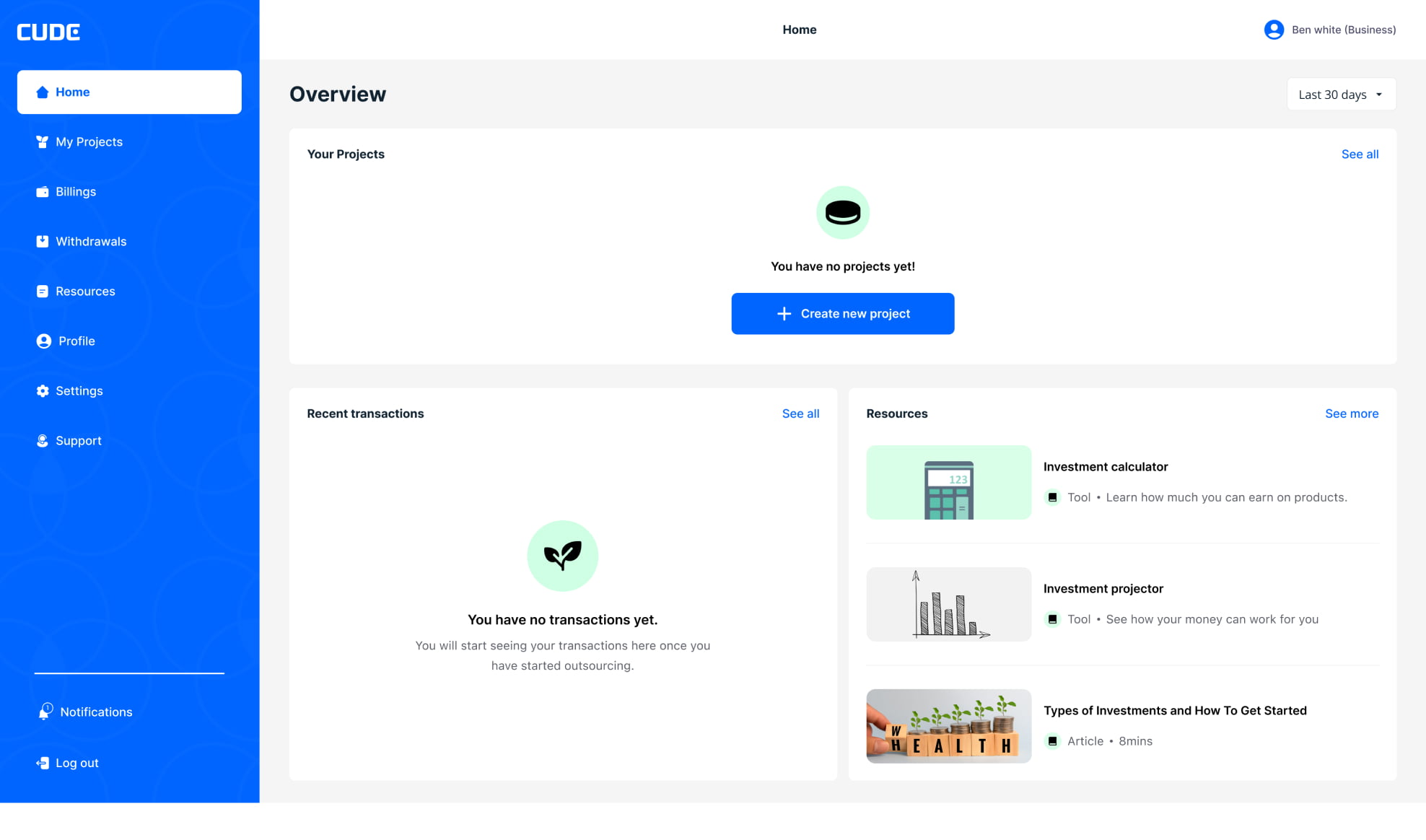
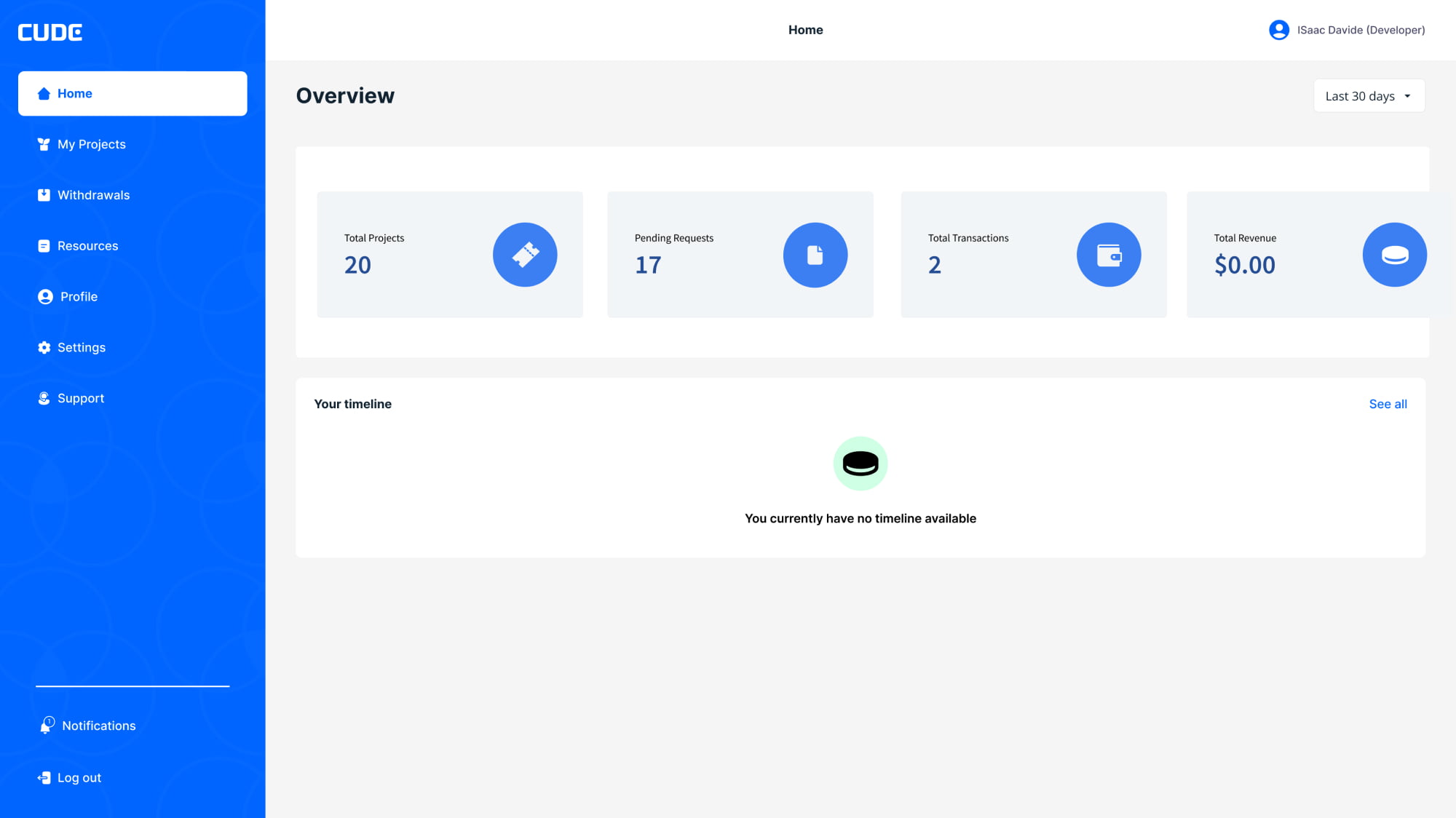
1.0 Simplified dashboard

We believe by building all round solution that serves people dealing with hand related conditions or injuries will eliminate delay in recovery or decision making. A handy mobile application, recommended by orthopaedic experts which contains physiotherapy exercises can enable patients to practice physiotherapy remotely and also keep a tab on their progress. Trustworthy and up to date resources around hand orthopaedics will guide users to take informed decision. Simple guided tests can help orthopaedic experts as well as patients to track range of movement and accurately quantify the result that improves the line of treatment.
Business’s dashboard
Clients dashboard

2.0 Designed for simplicity and confidence.

The interface design strives to be confident. It does not contain UI bling or unnecessary elements. We opted for clear, readable typography —choosing colours with high contrast to increase legibility in outdoor, low light conditions. The design is uncluttered, clean, large and well spaced. All our design decisions help to exude a sense of confidence in the design.

3.0 Bringing everything to one platform

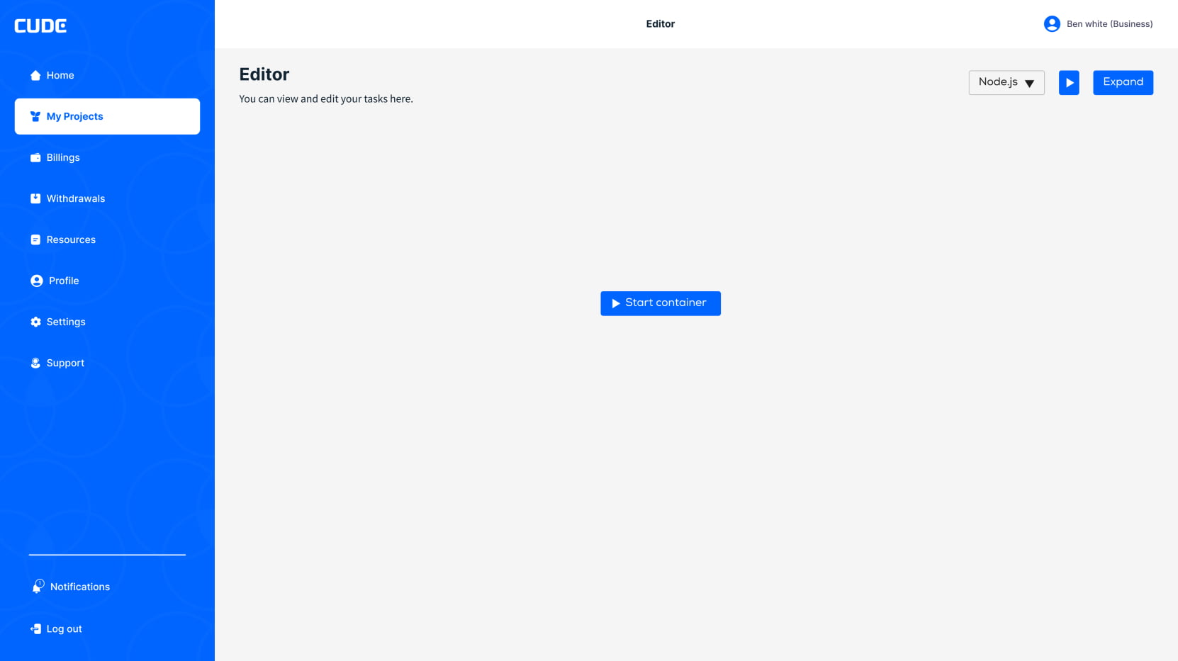
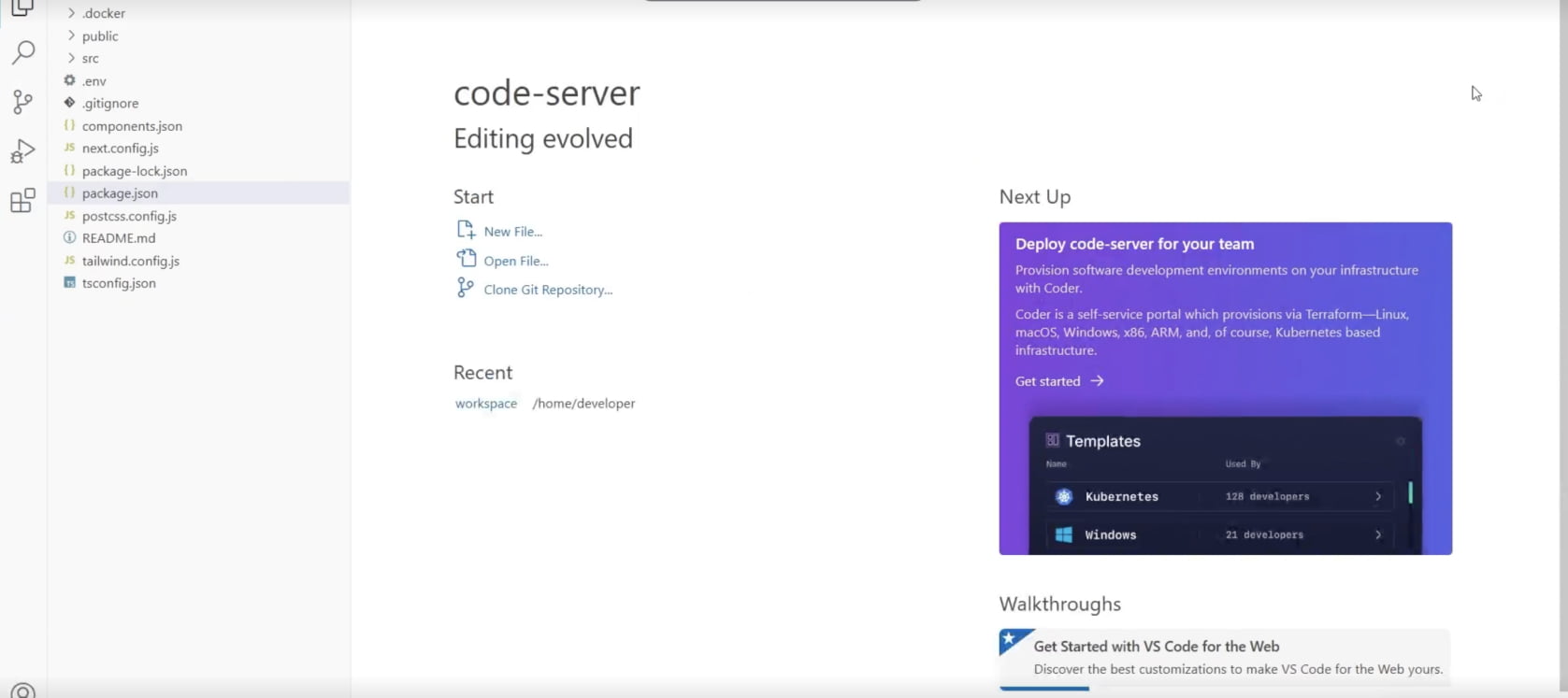
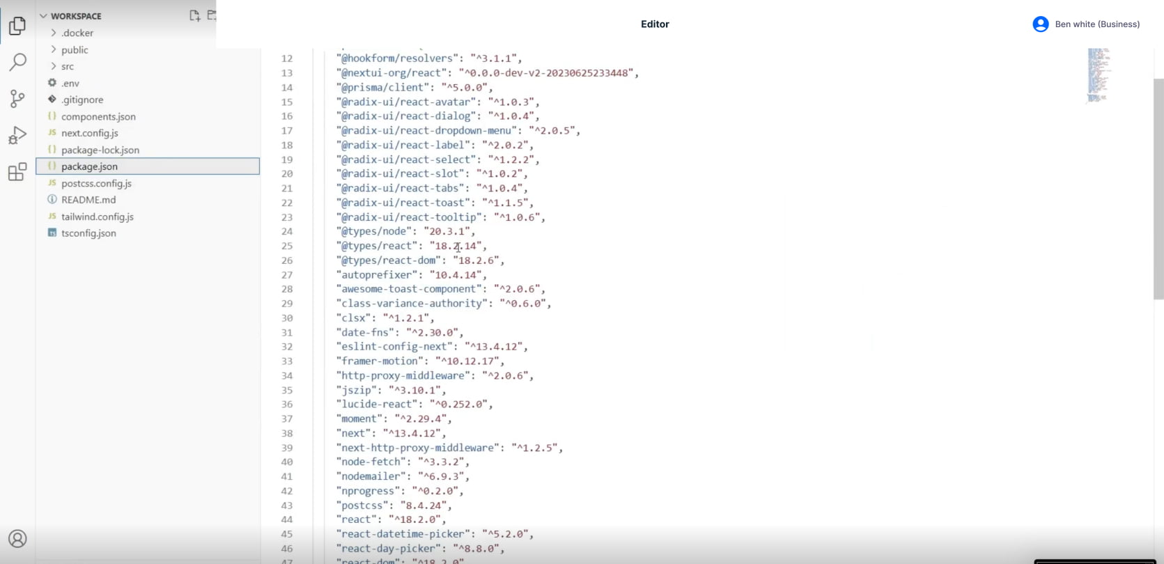
To protect the developer’s interest and the business interest, the codes are shared and worked on, on Cude by integrating a live editor much like Visual studio. This allows transparency and breeds easy collaboration between both parties.

Businesses have no access to download this code or use this codes until the developer has given permission to the business, hence safeguarding the developer’s interest as well.

Results

Achieved product-market fit and substantially increased waitlist signups, although Cude is currently looking for investors and still in beta stage, all feedbacks have been used toa create a better solution

Cude significantly increased waitlist signups by 168% and twice secured a spot at Birmingham Design week. Over 60% of users expressed disappointment at the idea of no longer using the app, surpassing our goal by 17%.

The approach . Focusing on Goals not Features

Although our brief was to develop better functionality than what the market currently offers, it was paramount that we stressed that engaging in a feature parity war was neither strategic, nor had the best interests of the users at heart. To differentiate ourselves in an already mature and competitive market of software intellectual property protection, we needed to define a desirable role for the product and how it would meet the needs of the scheme’s users. We were thrilled by the opportunity to create something more meaningful, and in many ways new.

A collaborative culture with lean UX

Due to the nature of the timeline of the project, I opted for a lean approach which emphasised rapid sketching, prototyping, user feedback and, design mockups. This created early team wide alignment, allows interests to align faster, while sparking tons of great ideas and created a strong sense of ownership across different disciplines within my organisation.

Building trust through UX workshop and transparency

To build the communication streams across all departments, I organised a design sprint, and UX workshop to share methods and thinking that will help to build a strong client relationship. This allows trust to be built across all stages and stakeholders by building a comfortable environment to share ideas.

Starting on the same page

Meeting with key stakeholders helped us to understand their business challenges. Together we identified risks and aligned on expectations and constructed a shared vision for the app. Following this, I crafted an experience strategy outlining our phased approach and direction for the app.

The Discovery

Early insights from user survey

To build the communication streams across all departments, I organised a design sprint, and UX workshop to share methods and thinking that will help to build a strong client relationship. This allows trust to be built across all stages and stakeholders by building a comfortable environment to share ideas.

Businesses need a more reliable way of protecting their interest i.e Intellectual property among others.

Businesses want to be able to manage the access that freelancers have to their intellectual property.

Freelancers do not often get paid

Freelancers feel left out as most solution caters mainly to businesses.

The discovery phase was a quick, high intensity effort that allowed us to define project milestones, audit the existing work, review the competitor landscape, understand our client’s vision, and begin research into user needs, behaviours and pain points. We also kicked off a technical discovery phase to understand feasibility and constraints.

Our research revealed that the concept of ‘outsource’ represented something different to different users. Users’ motivations for outsourcing or participating in freelancing, hinting at different requirements.

After designating persona types and aligning this with our phasing strategy we were able to prioritise who we would be focusing on supporting in the early stages.

We used personas constantly throughout the project to guide design decisions, priorities, and create empathy amongst the client and our team.

Who are we designing for?

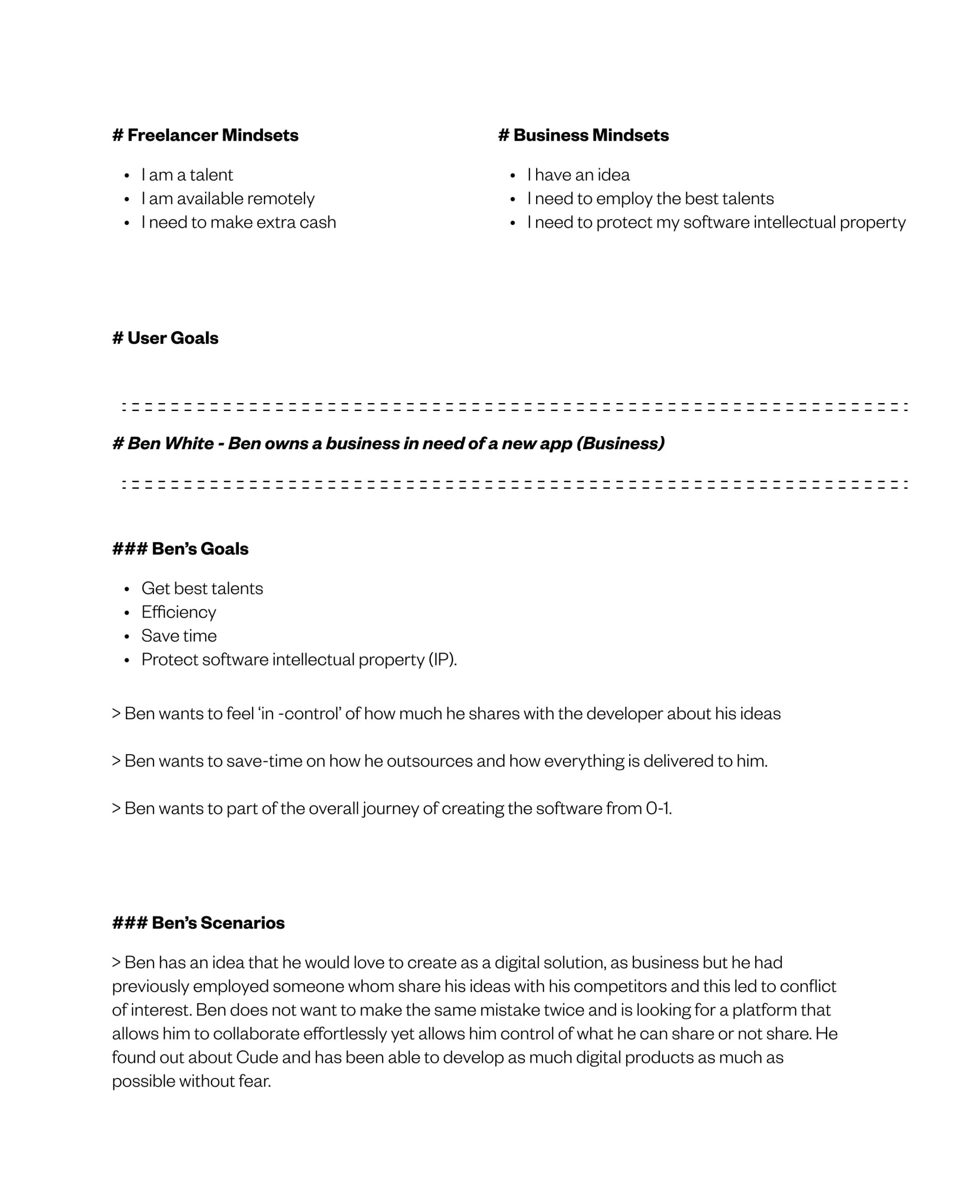
To have a better understanding of how to create a solution, there was a need to define the target audience, personas, and mostly the scenarios. From the initial research, it was clear who the product will serve. Even though, there were many user profiles created, it was easily streamlined to two broad user profiles.

The businesses / founder looking to outsource.

The freelancer looking to get the job done.

User interviews and research

Tight timing meant that we needed to be efficient conducting user research and collecting feedback. Luckily, the topic of outsourcing is not new to the general public and this provided us with ample participants. We conducted a range of interviews with stakeholders, co-workers and friends; looked to the twitter sphere to gauge what people were saying; and other social media platforms to understand users motivations for participating in both outsourcing and freelancing. These varied research techniques helped to quickly gain insights into the needs of our users and gave us a concrete understanding of the environment and workflows.

Businesses want a safer way of outsourcing.

Freelancers do not want to feel cheated.

User-flow; Visualising the end-to-end

I used experience mapping techniques to visualise and communicate the users end-to-end experience across various touch-points with the product. This allowed us to represent user pain-points and see where we needed to focus our attention. Mapping out the users emotions was key to setting client expectations about the aspirational emotional state we were aiming to design for.

Analysing the competitors

Whilst our competitors focus on creating a platform that allows smooth outsourcing and freelancing, none of the current solutions allow effective collaborations while protecting software intellectual property (IP). This for me, was a beautiful clear gap to be filled by Cude, as the pacesetter in this field.

Designing for what users want to know, do & feel

By using the insights from the user research, I was able to synthesize goals that served as a lensens through which we could consider not only what the product should do, but also how it should feel. We believed this would be the difference between delivering a good experience and a great one. Thinking about emotional design early on to understand the importance of aesthetics and tone of voice to the experience.

Storytelling About Ideal Experiences using scenarios

Knowing who exactly I was designing for, allowed me to ask myself how the solution fits into the lives of the users. I imagined ideal experiences and focused on how our personas think and behave rather than getting into specifics about interfaces, technologies or business goals.Keeping the scenarios at a high level allowed us to work fluidly and explore concepts that we could easily communicate with our team and client. They formed the backbone of our requirements, and allowed us to express these from both a functional and emotional perspective allowing for further empathy with our users.

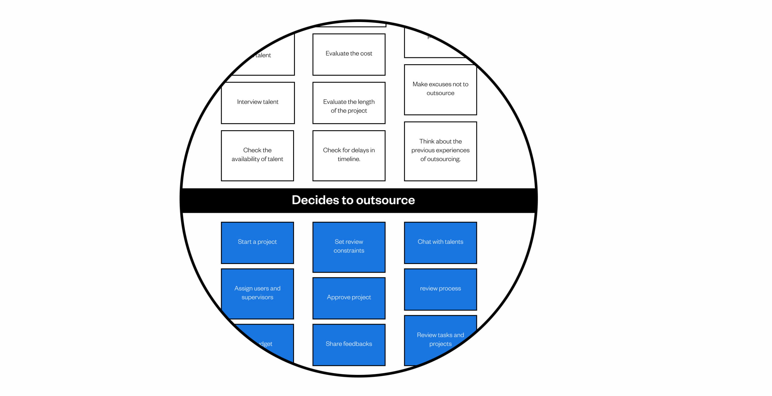
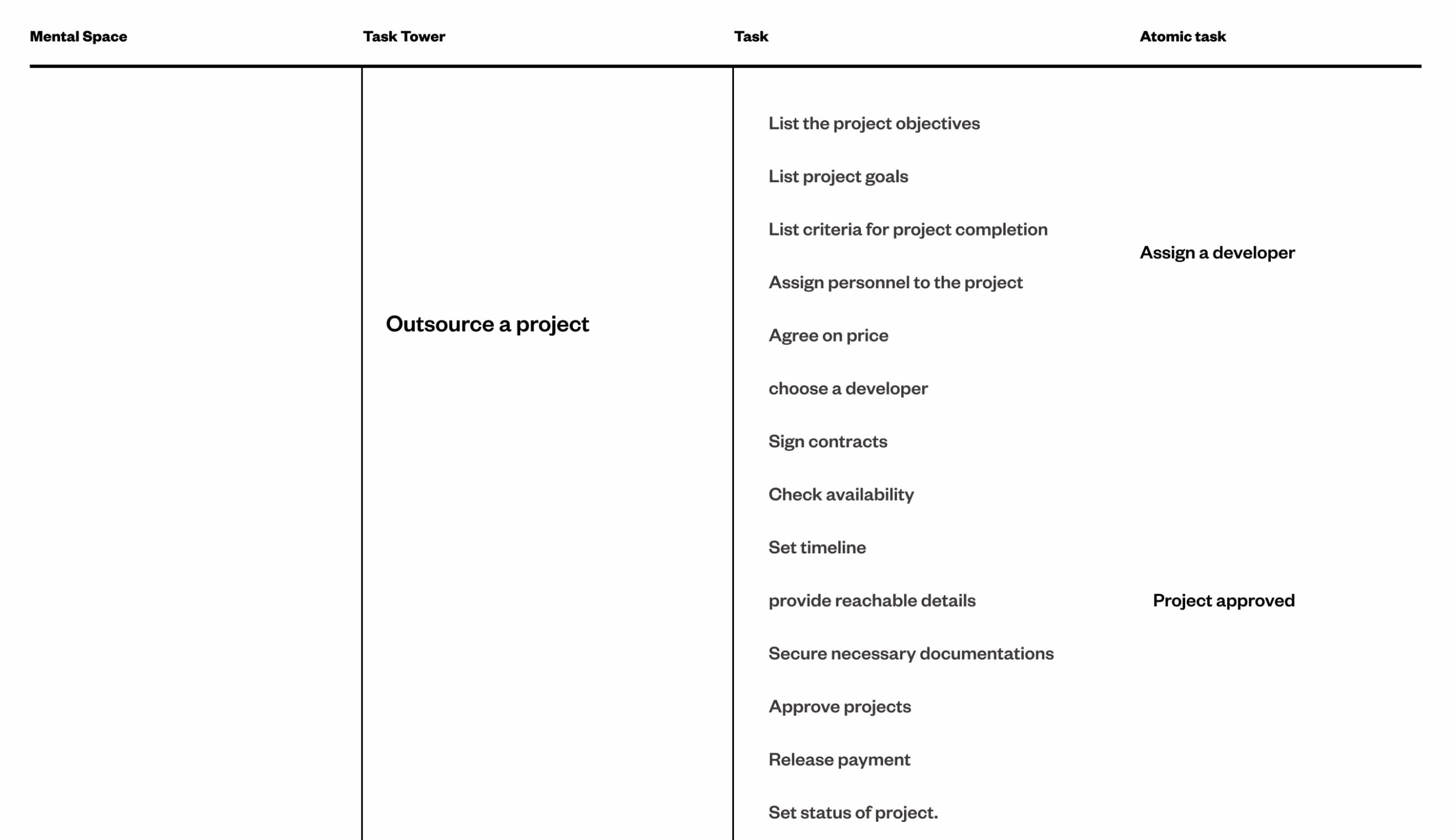
Extracting Requirements with Mental Models through card sorting

Combing through our research and brainstorming the different things people do before, during and after outsourcing allowed me to come up with a broad set of tasks–quickly. I categorised and segmented the tasks into behavioural affinities and aligned content and features. This gave me a way to visualise what existing functionality and content would be useful, what tasks needed supporting, what opportunities were available to innovate and also what could be discarded from the list

Afterwards, I entered all the ideas into a spreadsheet and prioritised them against our personas needs, tech feasibility, and business objectives. This informed the phasing strategy for the solution, the product feature roadmap and the product backlog.

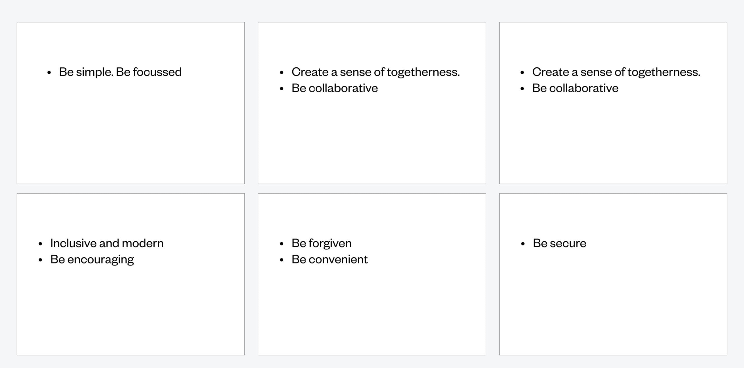
Branding as an Experience Requirement

Understanding the usage contexts of the product helped me develop a clear vision of the tonal expectations of our users. To communicate the personality of our product to our client and team, we developed a set of experience principles. These were used to sense check design decisions, articulate core values and describe key attributes the app experience should uphold for both the users and the brand. The principles were used constantly to drive the aesthetic, feel and overall tonal direction of the product.

Setting the Design Direction

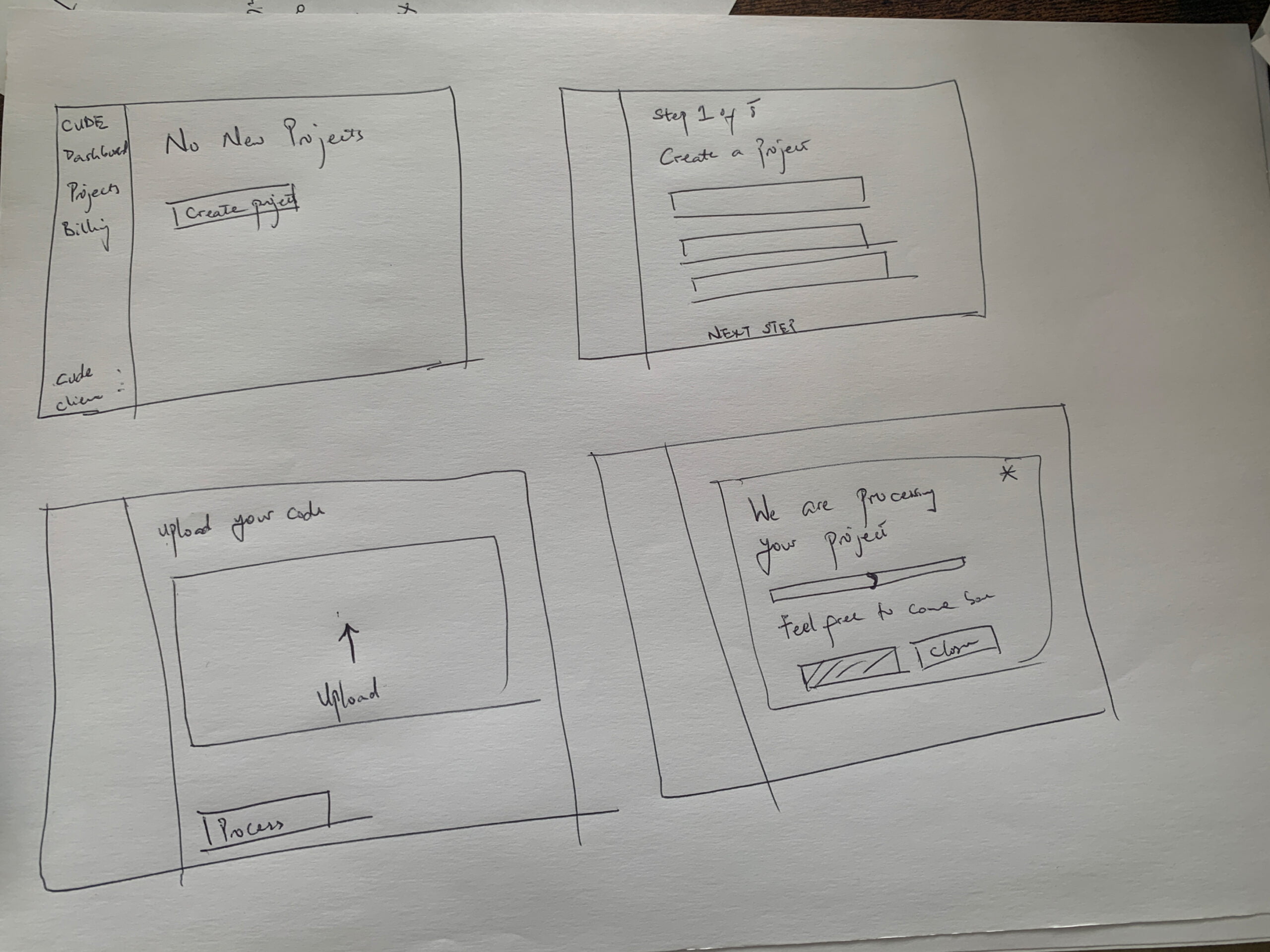
I took a top to down approach to defining the overall structure of the experience. Sketching and storyboarding, I generated stacks of ideas about the arrangement of UI, functional and data elements, and interactive behaviours. Starting broad, our vision began evolving into something tangible. A high‐level design language, interactions and the app’s anatomy began to piece together.

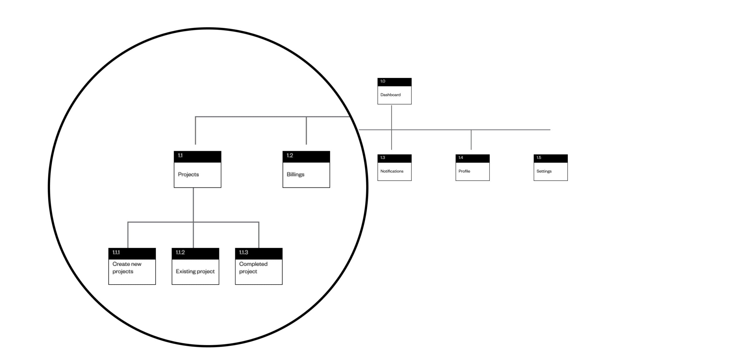
Information architecture - IA

Once the stakeholders approved the content and functionality to roll out in the app, I could start to structure that content. With the help of some participants, employed using the profiles created through the personas and scenarios, I was able to use the Jesse James Garrett’s Visual Vocabulary to represent the architecture of the app. Adopting a numbering system early was beneficial helping our team stay in sync.

Structuring the experience using HTA

After identifying the main ‘pain-points’ in our scenarios, I defined the primary pathways our personas would explore through the app. Crafting several key user journeys for each of our personas, was the best way to conceptualise and structure the proposed content and functionality. I began to think about particular usage contexts, the opportunities they present and how elements manifesting themselves in the interface would help to support the user.I storyboarded my ideas to help design and communicate more complex interactions and flows. This was a huge time saver and allowed me to avoid prototyping edge cases.

The Refinement

Testing With Users

I carried out the usability testing myself alongside other team members, Usability I defined tasks, establish objectives and evaluate the app.To ensure the test was realistic, we opted to use a figma prototype instead of using a real build of the application. Because allow corrections and iterations to be done and tested faster than decoding and write bug-discovery codes to find usability issues related to perceived affordances, layout, and discoverability.

Improvement 1

Modern imagery representation

Participants complained that the images initially used did not reflect who they are, some business owners want a young, elegant and active representation and when asked why, the reason behind this, the response was that they would like to represent their business as modern, not themselves.

Improvement 2

Account type selection

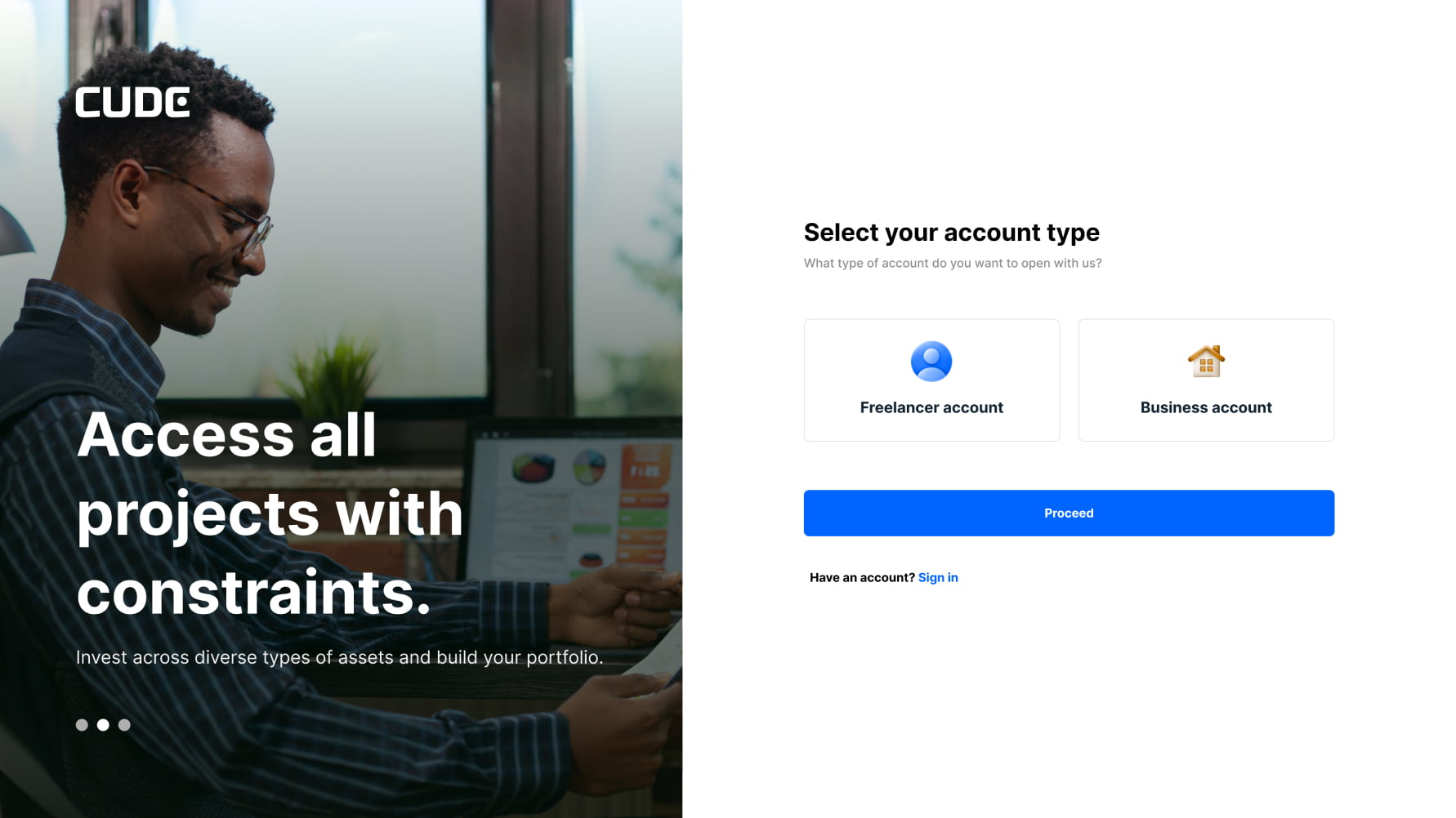
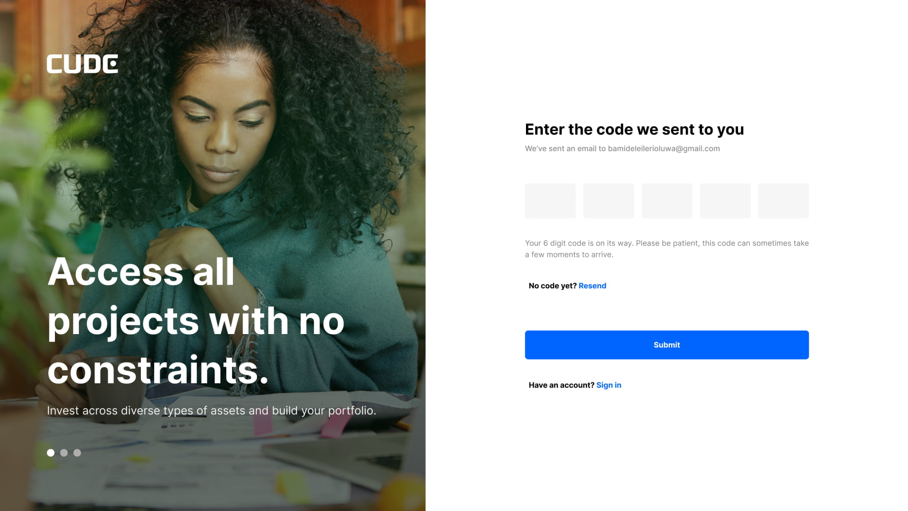
Participants pointed out during user testing that they were confused as to what they should sign in as, some said they could not see it as they skipped that option and just started entering their details. Some developers tried signing in as businesses and vice-versa. To fix this, I created another page for the account type selection for both sign up and log in user flow and journey.

Improvement 3

Descriptive button lables (CTAs)

While using testing the pop-up screens, most participants were looking for the cancel button to leave the page and go back to their previous page or dashboard. This negates what I hoped to achieve on the page, so I removed the cancel or back button and replace it with a descriptive button label.

Improvement 4

Simplified KYC and onboarding

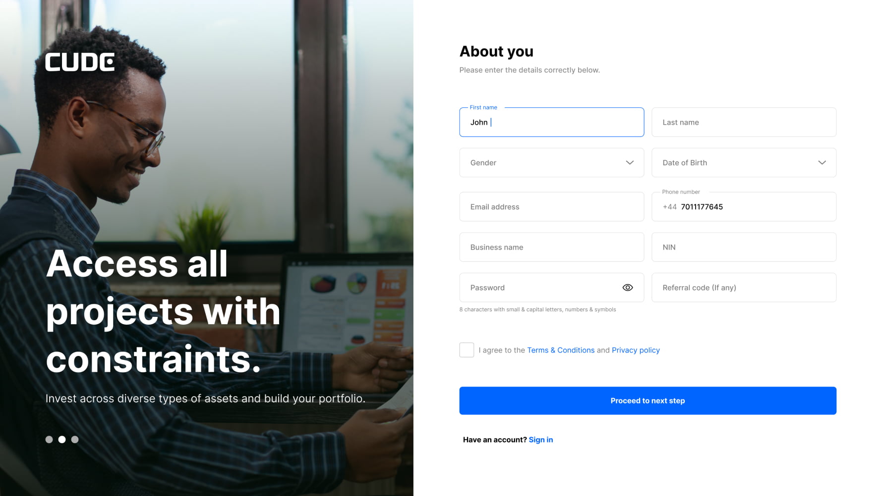
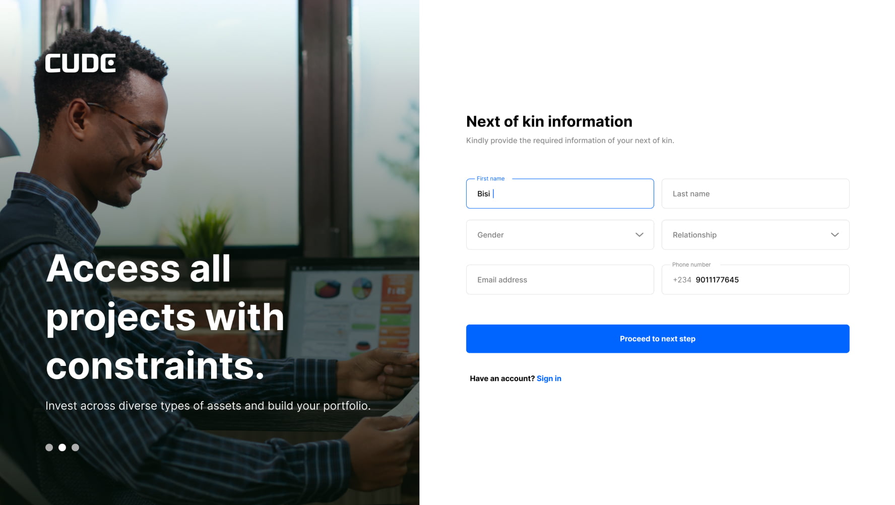
The initial KYC (Know-Your-Customer) process had 7 steps and most participants found it frustrating. I fixed this by making the registration process shorter, 3 steps.

The Impact

Over 2,000 subscribed testers during launch.

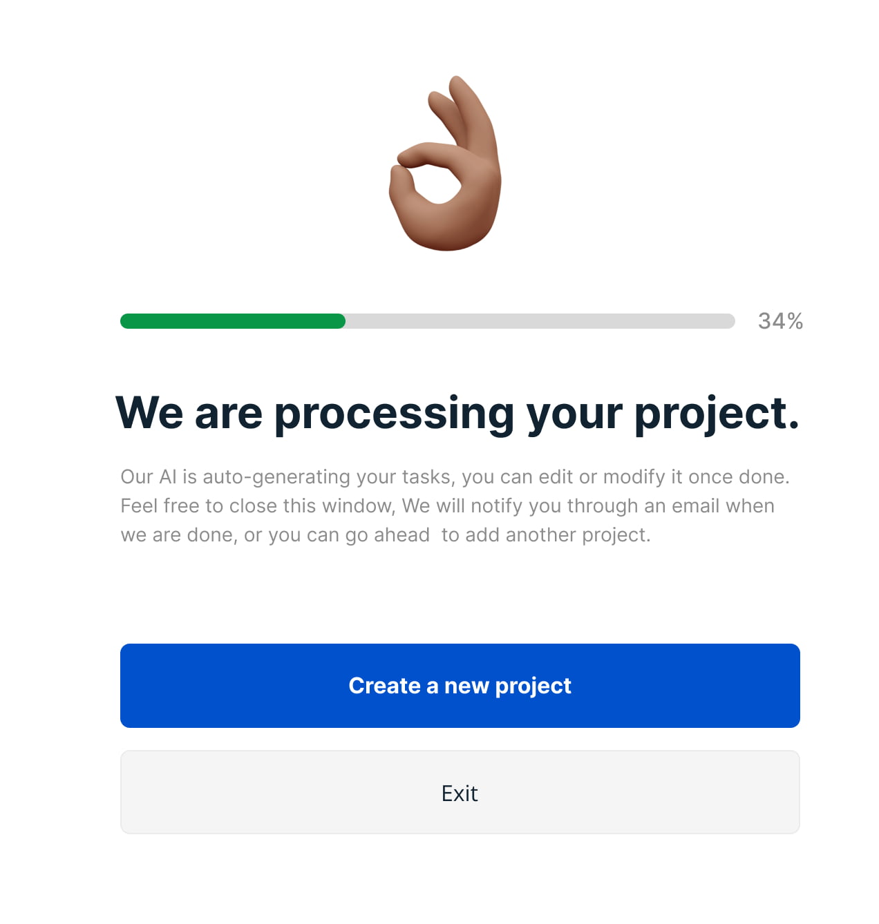
The Cude has received both positive and negative feedback since our version update. Users have responded well to the app’s features and the simplistic redesign. Unfortunately, negative feedback largely relates to the loading time of automation and accuracy of automated naming of tasks data—issues beyond our control and subject to ongoing improvements.