I established design quality benchmarks, and a continuous research practice at the company.
I created strategy required to hire participants and interviewing strategies, and leveling frameworks for the product, this includes UX research, and marketing.
Drove revenue growth by influencing product, marketing and customer support functions as a key member of the leadership team.
Created a design system to unify components, styles, grids, typography, and iconography to improve the efficiency of design delivery.
Product Designer
Worked as a product designer on a team of 4, product strategy, research, IXD, visual design, illustrations/icons, A/B testing (Split testing).
3 months
A lot of people, especially those that work on desks or engineers or gamers or anyone that uses their hands regularly in everyday activity have been said to have pains in their hand and this pain could be associated with Carpel-Tunnel Syndrome (CTS).
CTS is pressure on the nerve in one’s wrist. It causes tingling, numbness, and pain in your hands and fingers. In order to better understand the problem, we looked at some secondary research.
Consultant Orthopaedic Surgeon at RWT Wolverhampton
& Nuffield Health Wolverhampton Hospital
Patients diagnosed with hand-related conditions or injuries are advised to perform extensive physiotherapy for their recovery where many patients fail to commit to regular in-person physiotherapy sessions due to many internal and external factors like distance, lack of time, affordability, inconvenience, work commitments, lack of motivation etc that results in delay in recovery.
Many of them find it challenging to track their progress systematically and take informed decision. People who try to explore possible causes behind their symptoms online, face information overload. Orthopaedic experts predominantly inspects patients range of movement for diagnosis with physical examination and personal judgment however this technique does not present any accurate metrics which can be quantified or compared.

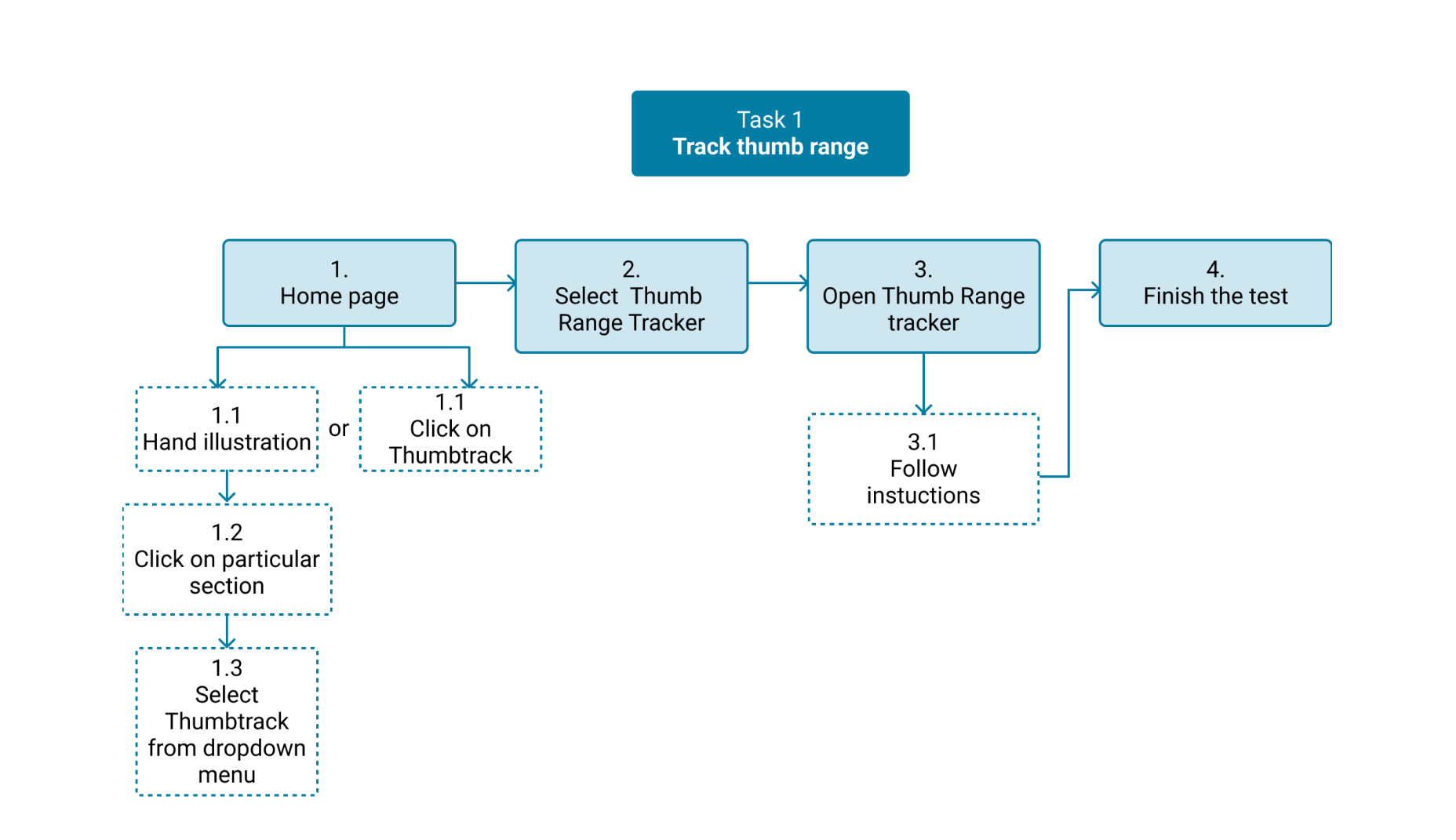
One of James’ patients is experiencing thumb pain. James examines their hands using traditional, physical methods but he is unable to obtain an accurate, measurable result. He discovers OrthoPal, an app capable to capture and record the range of thumb movement. James now uses OrthoPal to assist his patients better by integrating the new data and produce more accurate diagnosis. He guides user to perform a simple interaction to capture his range of movement and utilises that metric to diagnose and define the line of treatment. He then recommends his patients to perform the same interaction at home regularly while OrthoPal keeps a track of progress which James is able to review.

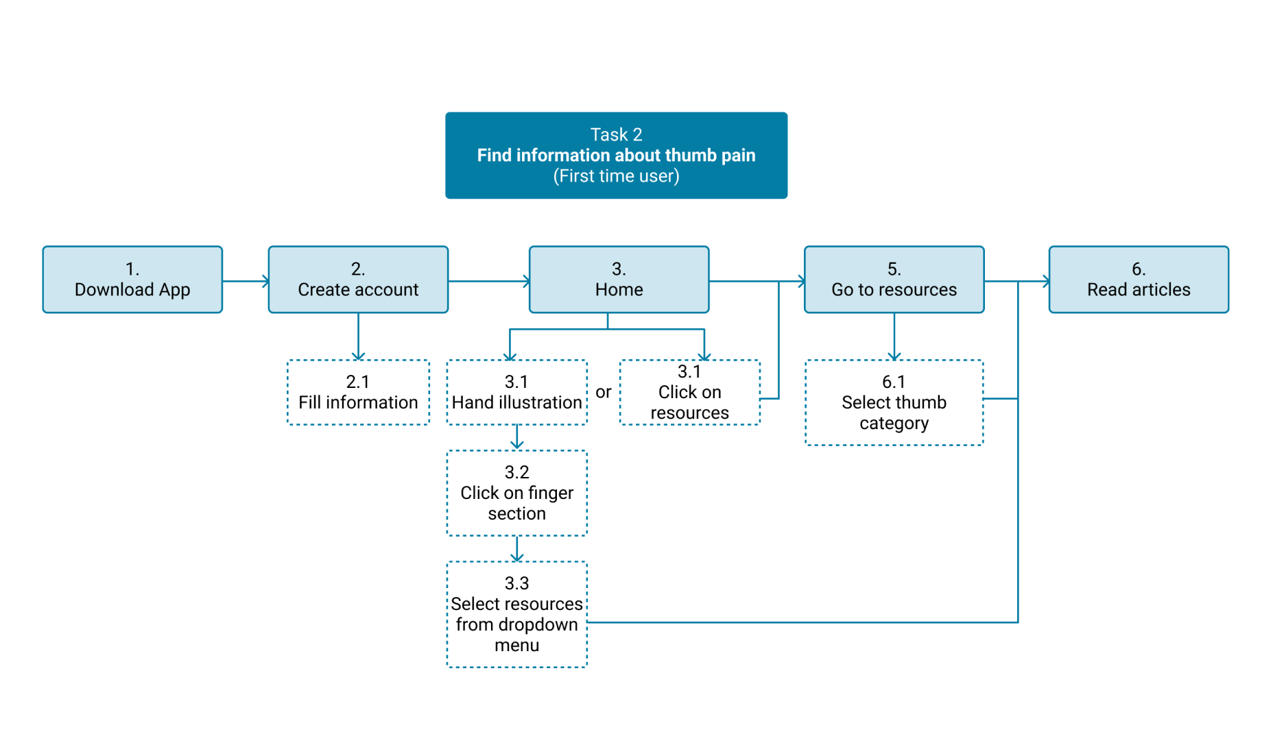
Chase is overwhelmed about his condition because of all the information he has found online. He discovers OrthoPal’s resources which he found quite concise and insightful so he decides to explore further. He notices that the app is backed by Orthopaedic experts so he is persuaded to start using it to address his pain and discomfort. He has now gained knowledge of hand related conditions, its implications and ways to deal them.
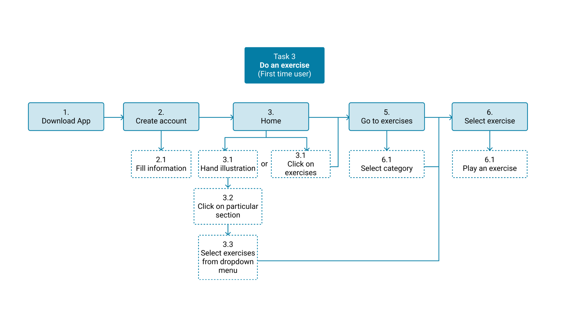
Jenny has been diagnosed with Carpel Tunnel Syndrome and needs guided physiotherapy sessions but she finds it inconvenient to travel physically for frequent sessions. After her diagnosis, her doctor recommended her to use OrthoPal app as it provides specially designed physiotherapy exercises the help to treat Carpel Tunnel Syndrome. With the help of her doctor, she learnt how to access the exercises content within the app and track her condition.

Maria is recovering after a wrist operation and she is looking for a reliable and advanced rehab program that she can do remotely. She is advised to download OrthoPal by her orthopaedic surgeon and she starts her rehab program right away setting into motion her recovery. She has been able to accommodate this program around her routine comfortably. She also tracks her progress in between and shares her progress reports with her doctor on her follow-up post-op appointments.
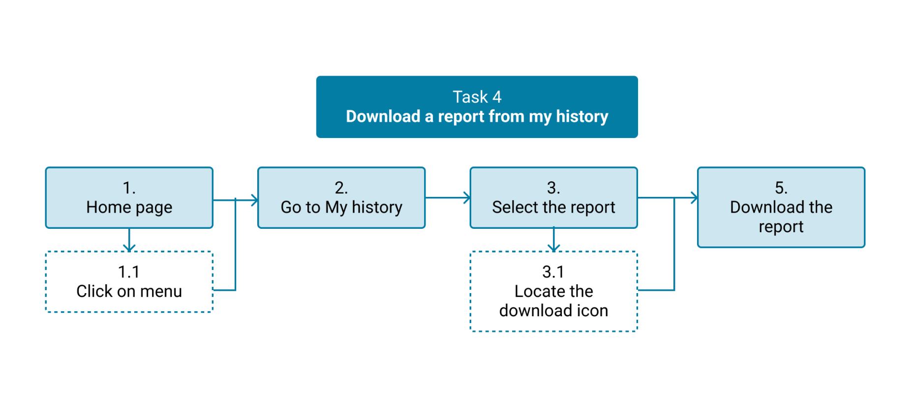
We validated our system’s model with user’s mental model.
We compared our information architecture with user’s mental model. We observed that maximum users sorted the cards in the categories that are defined in our information architecture.
By replacing the onboarding and KYC with a contextual video, this helped reduce the time spent getting into the app.
One of the main features of Orthopal is the ability to capture the stress level of the patient by gamifying the real-life scenario of how doctors diagnose patients.
From the user-survey, user research, and most importantly UX-group sessions, it was paramount to provide users with the ability to exercise and learn more about their condition. Providing them with these options makes the applications to cater for a wide range of users.
For the sake of accountability, the feature was added to allow users track their progress as they use the app over a period of time and most importantly, they can share this reports with friends and family or even their doctors.
To eliminate the impression that hand illustration and test are related, we added background to hand and label to test.
Participants were not able to identify what icons mean initially so we added labels to make meaning clear.
Participants could not understand the current status of sorting so we included a label.
Participants could not understand the current status of sorting so we included a label.
Throughout this project, I observed how bias-for-action mutated into a bias-for-delivery. Our team disproportionately focused on measuring outputs, rather than learning and measuring outcomes due to the time limit. This inevitably led to short-sightedness and distraction for the team.
We let the question “how quickly can we build it?” define the it, more than we let our customers define it. We let the phrase “let’s just get something out there” define quality, more than we let our customer define quality.
If we had asked “are we building the right thing?” as much as we asked “are we going to meet our date?“, we would have launched a more reliable, intuitive and polished product, sooner.
Viability should have been defined by our customers way before the technology and date already did.
I value simplicity, focus and utility. I aspire to make people happy by designing experiences that just get out of the way. Craftsmanship and carefully thought out details are important to me. I truly value health and care about helping people improve their lives.
At the time of this design, I had difficulty accepting the reality of this product, because I knew that Quality that should never be compromised, even in the first version of a product. Quality is the responsibility of an entire organisation and I have learned that magical experiences are only possible if the whole team truly shares in the same values and aspirations.
Fast forward to the present, and I realise that my satisfaction and insistence for quality does not seem to matter at all. The success of this product had nothing to do with how I feel, but everything to do with if and how the product is being used.
I am proud that the team is in a better position to learn, and that the development of this product needed to happen in order to expose how badly things were broken—both in the product and in the way we were working. I believe that great design takes time and wisdom, which is only possible if the entire team is in a position with an accompanying mindset to learn.
Today, I am more aware of the importance of carrying your users along your design journey and how important their influence is. User design has become a form of democracy for the users for me. And while I can’t prove how much the extra mile would have benefited our business, at least the product is not considered done.