Project
Quick Links
ScanAccess
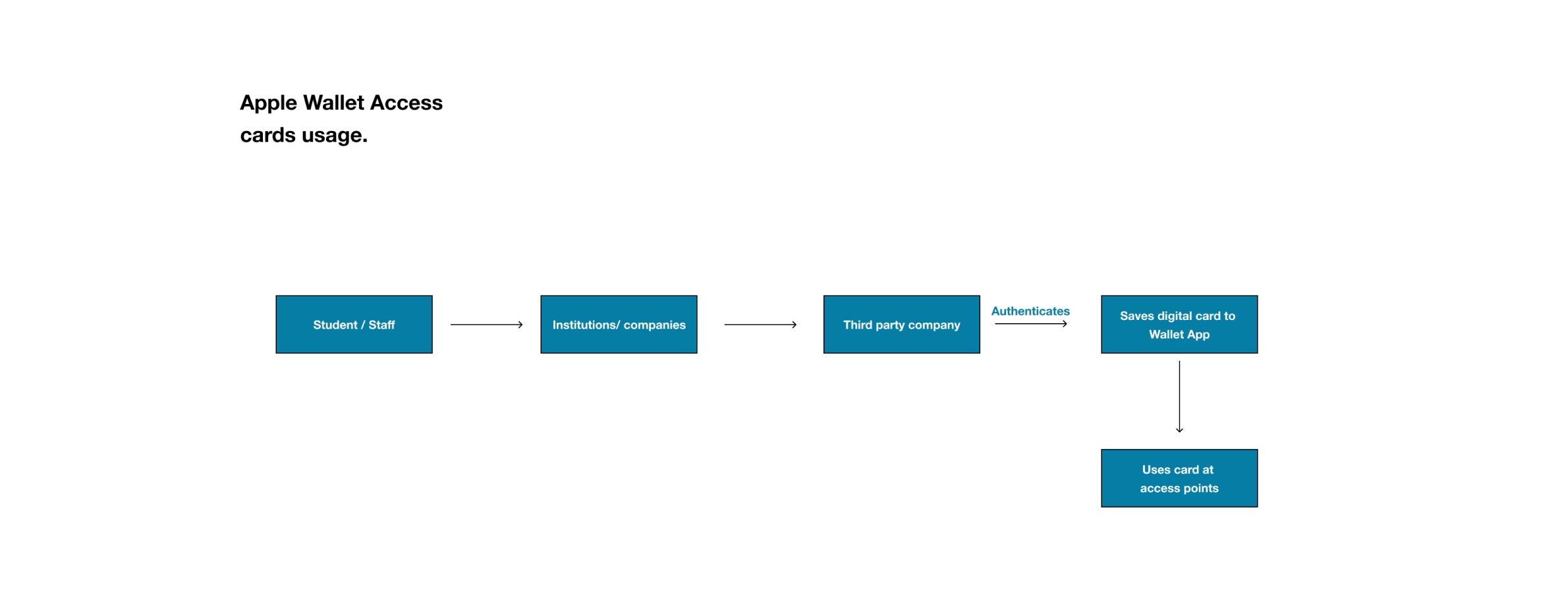
ScanAccess is an app designed to allow you to scan your access card with your mobile phone, save the card details, and allow you to use the card to “tap & authenticate” at entry points or gates. It also allows you to share this authentication with guests as well while also allowing you to track the activities on the access cards.
Summary
I was responsible for the research, interaction design, visual design, copywriting, user testing, prototyping and user survey
I worked alongside 3 creative minds to bring this product to life as the only product designer on the team and also the lead.
Role
Product Designer
Core Responsibilities
Creative Direction, Product Strategy, Competitive Analysis, Guerrilla Usability Testing, User Flows, Interaction Design, and Visual Design.
Timeline
6 months
Problem
Addressing the efficient way of accessing one’s buildings with or without one’s physical access / key cards.
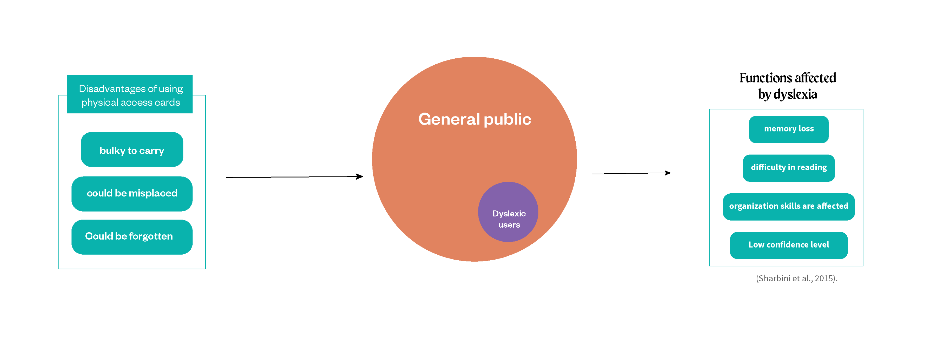
The problem at hand revolves around the inadequacy of current access card designs in addressing various challenges, including memory loss and card misplacement. The lack of a comprehensive framework that considers diverse user abilities, disabilities, and technological proficiencies hinders the effectiveness of access card applications. Furthermore, the existing research on inclusive design often lacks specificity in addressing the unique requirements of access card systems.
ScanAccess is designed for entry into buildings or secure environments, represent a pivotal convergence of design thinking to address multifaceted challenges, including memory loss and card misplacement.
Goals
To bridge the gap between the physical and digital world using access cards which can serve both worlds.
Core Goal
The main goal is to make access to work environments, institutions and homes, less stressful and less annoying for users but most especially people living with impairments.
Evaluative research insights
Core insight
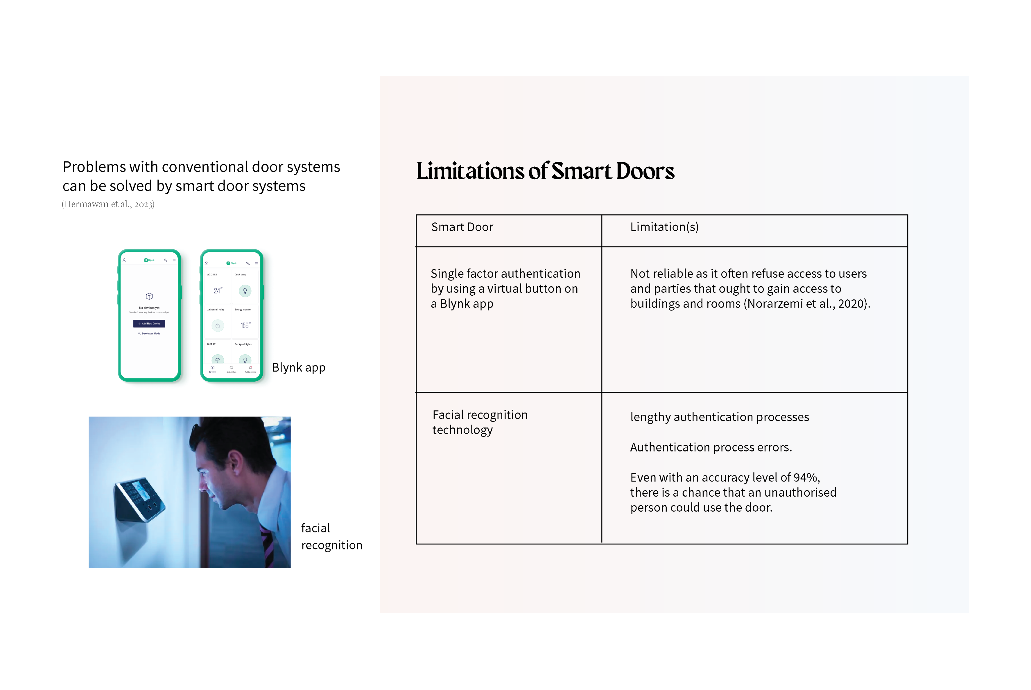
Keys have always play an important role in the security system. Most security systems use the conventional door locks while some have moved to smart door system.
Insight 1
Customizable Accessibility Settings
While customisation features enhance user agency, their implementation necessitates a careful consideration of security implications. For instance, allowing users to customize authentication elements must be balanced with ensuring that security is not compromised in the process.
Insight 2
Dyslexia: A Unique Challenge in User Experience Design
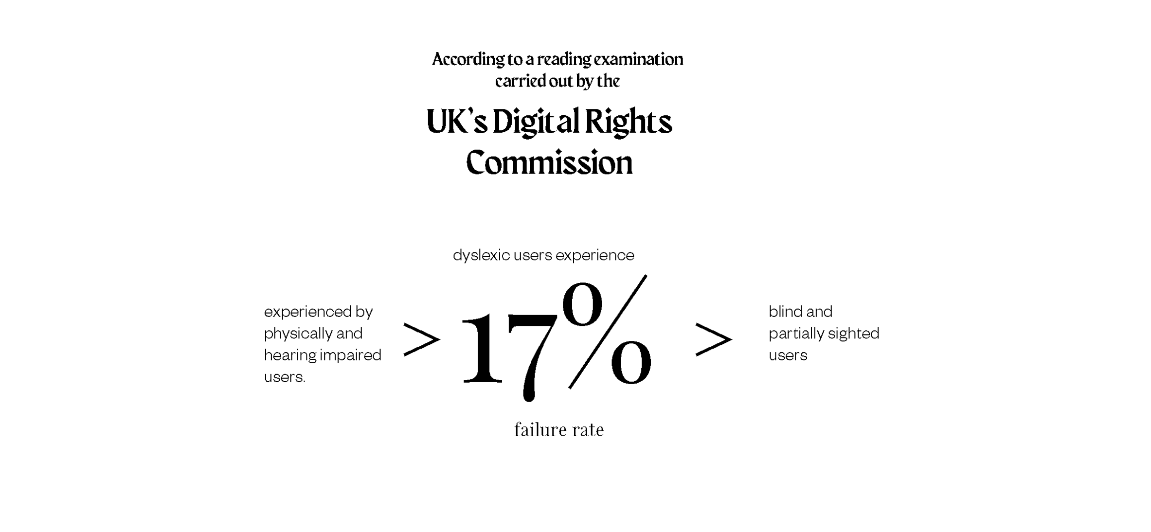
From the research carried out by the UK Digital Rights commission, there is clearly a need to consider other impaired users when designing for others.
Insight 3
Designing for all is a must.
There is a critical need to design for those who feel excluded or discriminated against; by designing for them, we empower them
Second, when businesses or corporations incorporate inclusive design into their products, their social value increases.
Third, there is a growing emphasis on the social value of corporations.
Competitor analysis
Understanding the market
Personas & Scenarios
Understanding the users
Profile 1
Personas with cognitive impairment.
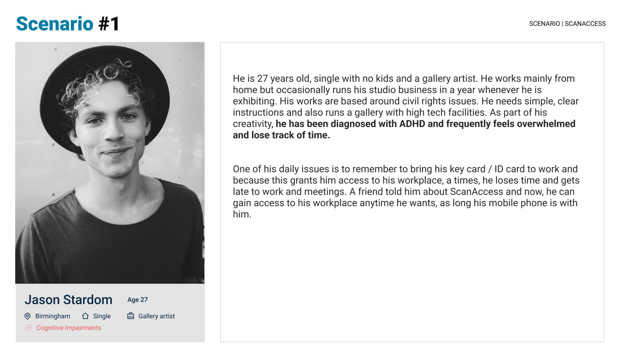
Jason is 27 years old, single with no kids and a gallery artist. He works from home but occasionally runs his studio business in a year whenever he is exhibiting. His works are based around civil rights issues. He needs simple instructions and runs a gallery with high-tech facilities. As part of his creativity, he has been diagnosed with ADHD and frequently feels overwhelmed and loses track of time. He currently uses his mobile phone to keep track of his activities. Despite his impairment, Jason is determined to live an active and fulfilling life.
Profile 2
Persona with hearing impairment.
Rosemary is 34, a graduate student and journalist living with a hearing problem (sensorineural hearing loss). She travels a lot for work. She manages most of her life while she is on the move. She prefers to have everything needed on her mobile phone as that makes her life easier. She keeps up with recent events with a daily podcast and lives by her phone. She is a huge fan of captions and uses hearing aids in her daily activities.
Profile 3
Persona with visual impairment.
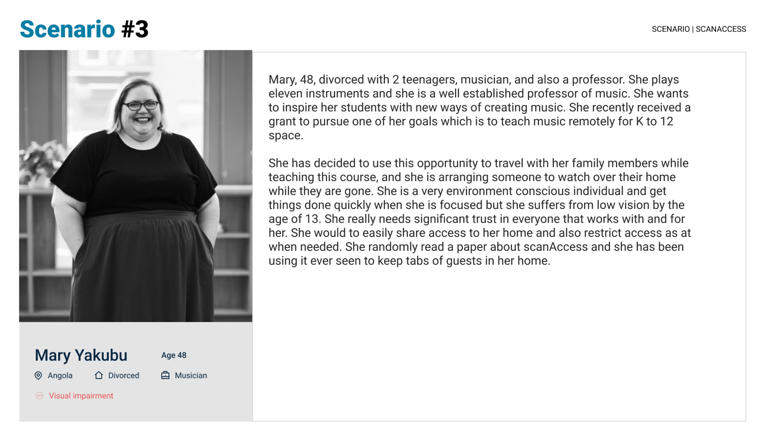
Mary Yakubu is 48, a professor, musician and mother to 2 teenagers, living with a low vision impairment. She prefers to have everything needed on her mobile phone as that makes her life easier. She keeps up with recent events with a daily podcast and lives by her phone. She is a huge fan of captions and uses hearing aids in her daily activities.
Profile 4
Persona with physical impairment.
Gideon is 27 years old. He recently moved to the United Kingdom to pursue his master's program in user experience design at BCU. He is passionate about music and arts and has a flare for modern technology. He has been diagnosed with mid-level carpel-tunnel syndrome; he feels pain in his palm after many hours of working on his PC. He currently takes short breaks in between work and tasks to rest his fingers.
Solution 1
Inclusive design for physical impairment
Gideon is 27 years old. He recently moved to the United Kingdom to pursue his master’s program in user experience design at BCU. He works part-time as a bar staff during his weekends. He has been diagnosed with mid-level carpel-tunnel syndrome; he feels pain in his palm after many hours of working on his PC. For him, it is essential that ScanAccess reduces the stress on his palm.
Every action button of the app has been designed in such a way that it reduces the stress on Gideon’s fingers. The button size is 52 pixels in height, which is in line with WCAG.
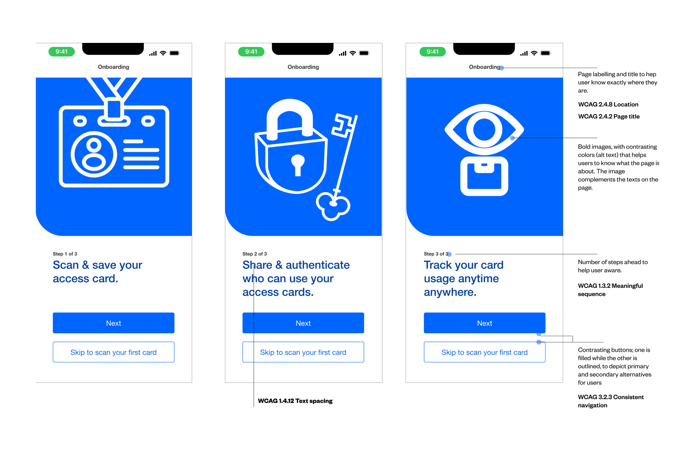
The onboarding process and steps were marked out in such a way that Gideon is aware of how many steps it will take to complete a task and if it any point, he wants to take a break, he can use the “skip” ahead.
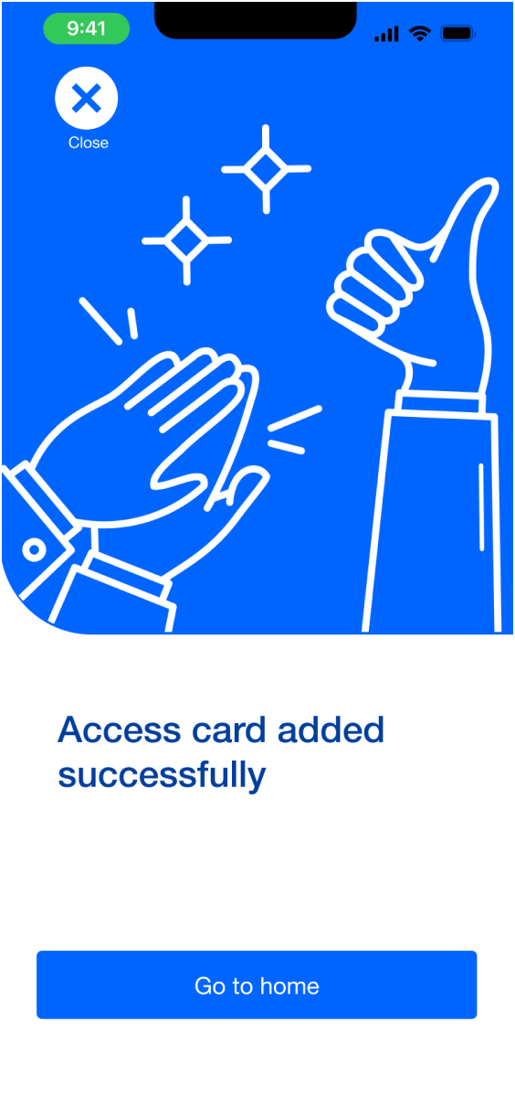
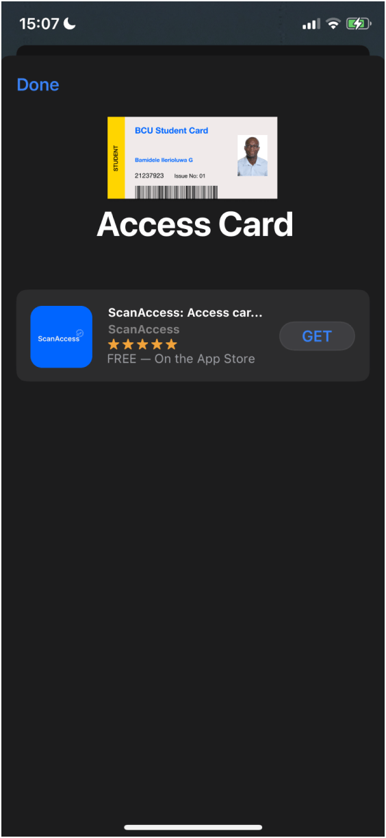
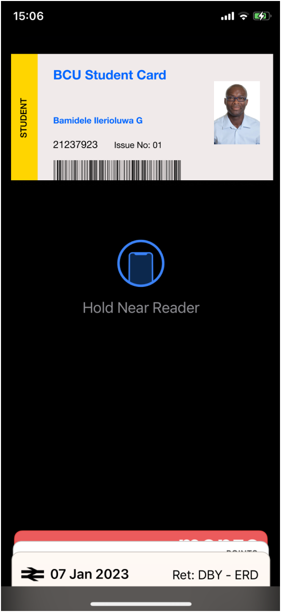
The ability to add his access cards to the wallet shortcut also helps to reduce the amount of time Gideon spends on his phone, which reduces the stress on his hands as seen below.
The designs and labels have been put in place such that Jason does not lose his focus and even if he do, he can easily find his way. Every process has been labeled effectively, with an ability to skip ahead, and the design uses the same imagery for all successive events, which helps Jason to be more aware.
At the end of every process or decision, a confirmation is shown to the user to make final decisions like deleting cards, freezing cards, etc. Across the app, the buttons are placed consistently at the same place for good memory but most importantly, the ability to add a card to wallet shortcut will help Jason to easily access his cards when needed.
Solution 2
Inclusive design for cognitive impairment
Jason is 27 years old, has been diagnosed with ADHD and frequently feels overwhelmed and loses track of time. Due to his ability to forget things easily and lose focus, here are some of the design considerations put in place for Jason.
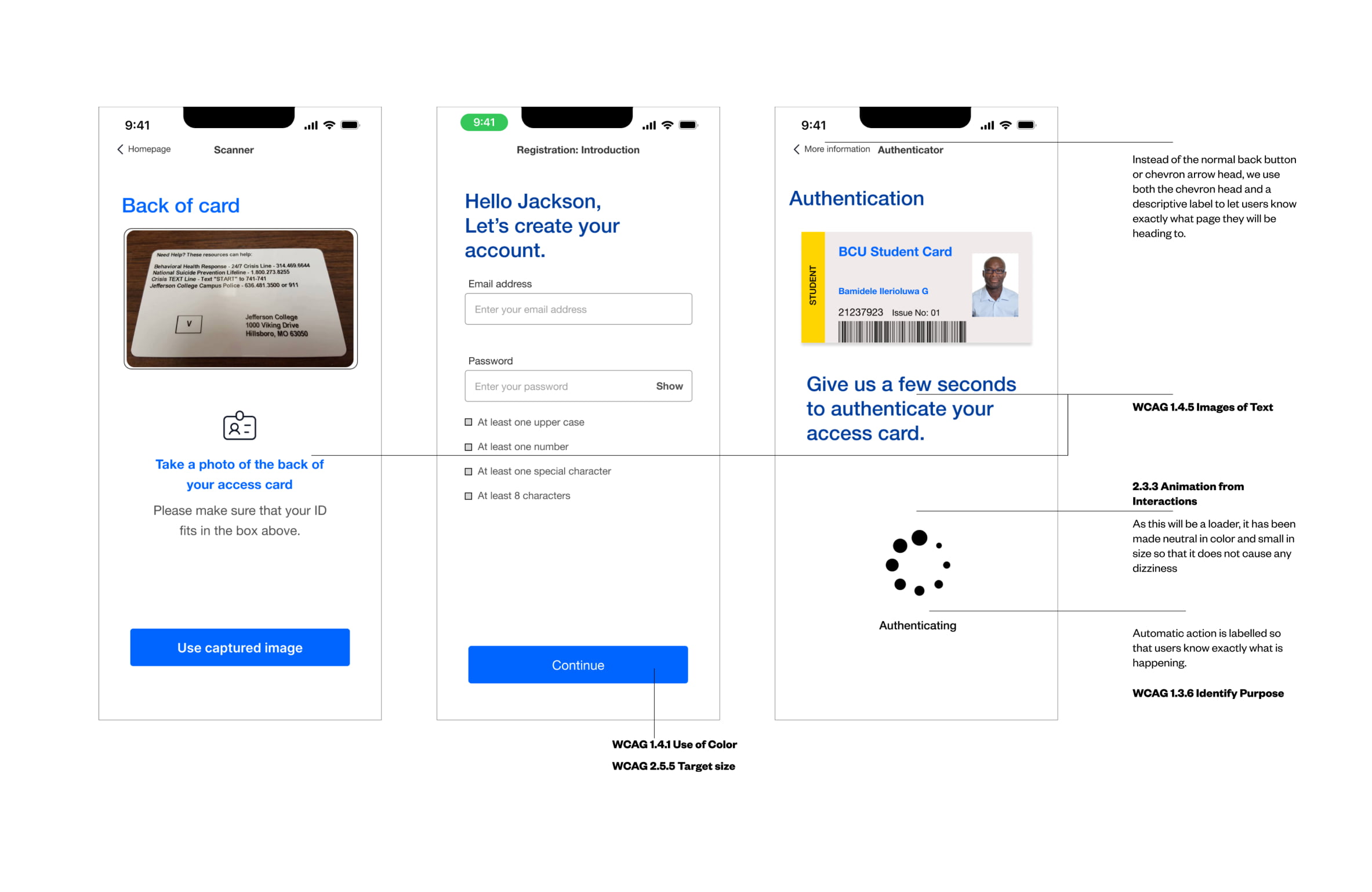
All pages have page titles and labels to let the user know exactly what page they are on and the “back” button is replaced with a “back arrow” icon and a page title of the previous page as shown below.
The designs and labels have been put in place such that Jason does not lose his focus and even if he do, he can easily find his way. Every process has been labeled effectively, with an ability to skip ahead, and the design uses the same imagery for all successive events, which helps Jason to be more aware.
At the end of every process or decision, a confirmation is shown to the user to make final decisions like deleting cards, freezing cards, etc. Across the app, the buttons are placed consistently at the same place for good memory but most importantly, the ability to add a card to wallet shortcut will help Jason to easily access his cards when needed.
Solution 3
Inclusive design for visual impairment
Mary Yakubu, 48, divorced with 2 teenagers, musician, and professor. She plays eleven instruments, and she is a well-established professor of music. She has low-vision impairment and reads at 800% magnification. Even though most mobile phones, especially the iPhones come with magnifier features. ScanAccess allows come with the magnifier option in the settings, as well as the “Text to speech” feature as well.
Designing for Yakubu means that the pages must be designed in a logical way, from left to right and top to bottom. We provided page titles (WCAG 2.4.2), section headers (WCAG 2.4.6), consistent navigation across all screens (WCAG 3.2.3) and most importantly, all links and buttons are defined with descriptive labels that makes it easier for users to identify their purposes (WCAG 1.3.6).
For a user with severe sight impairments that cannot rely on visual communication. They require additional aid when interpreting information. Alternative (Alt) text is used to describe the appearance and function of visual elements. Descriptive text for photos, illustrations, icons, so a screenreader can read it aloud. Also, the pages have been designed to follow a linear layout format; left to right, top to bottom layout, which makes it easy for a screenreader to read aloud.
Solution 4
Inclusive design for hearing impairment
For Rosemary, who is 34 years old, a graduate student and a journalist. She has been diagnosed with sensorineural hearing loss. For Rosemary, the text contrast is essential. In the design, emphasis was laid on text hierarchy, contrast, and descriptive buttons.
The app settings allow Rosemary to toggle on the haptic feature that allows her to get vibration feedback when any action has been completed or new notification is coming through.
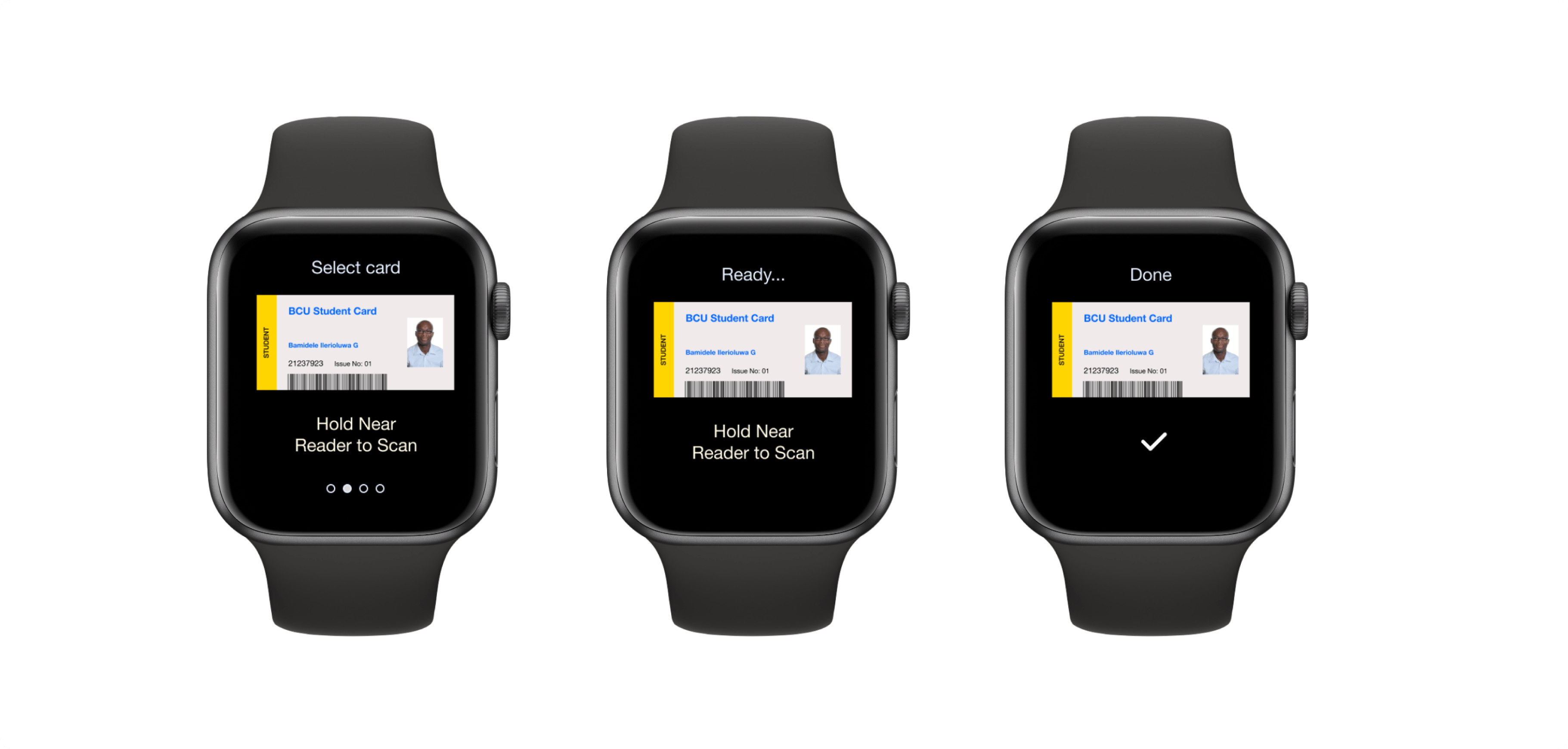
Haptic feedback allows users to receive information through the sense of touch, and this has helped people with hearing impairments to be included in design process and have access to new technologies. On the smart watch, users can get real time updates of where their access cards have been used, they can keep track and be aware in case of a breach.
This feature is also essential for people that are always around noise and a lot of people. It is important to note that for this app, there is no need to acquire new expensive gadgets that might be inaccessible to some users due to its excessive cost, users receives short vibrations from their devices as a means of notifications that allow them to know when their card has been scanned successfully, used successfully or shared, and a long vibration when there is an error. All these have been built in the smart phone devices and can be activated from the device settings or ScanAccess settings.
Apart from the use of haptic feedback, the screens are designed to be visual pleasing, most importantly by paying attention to the colors used, contrast, the grid system, and most importantly legibility of texts and purpose of links and images, such that Rosemary is aware of every action needed to be taken and these actions are easily discoverable.
Solution 5
Multi-Platform Accessibility
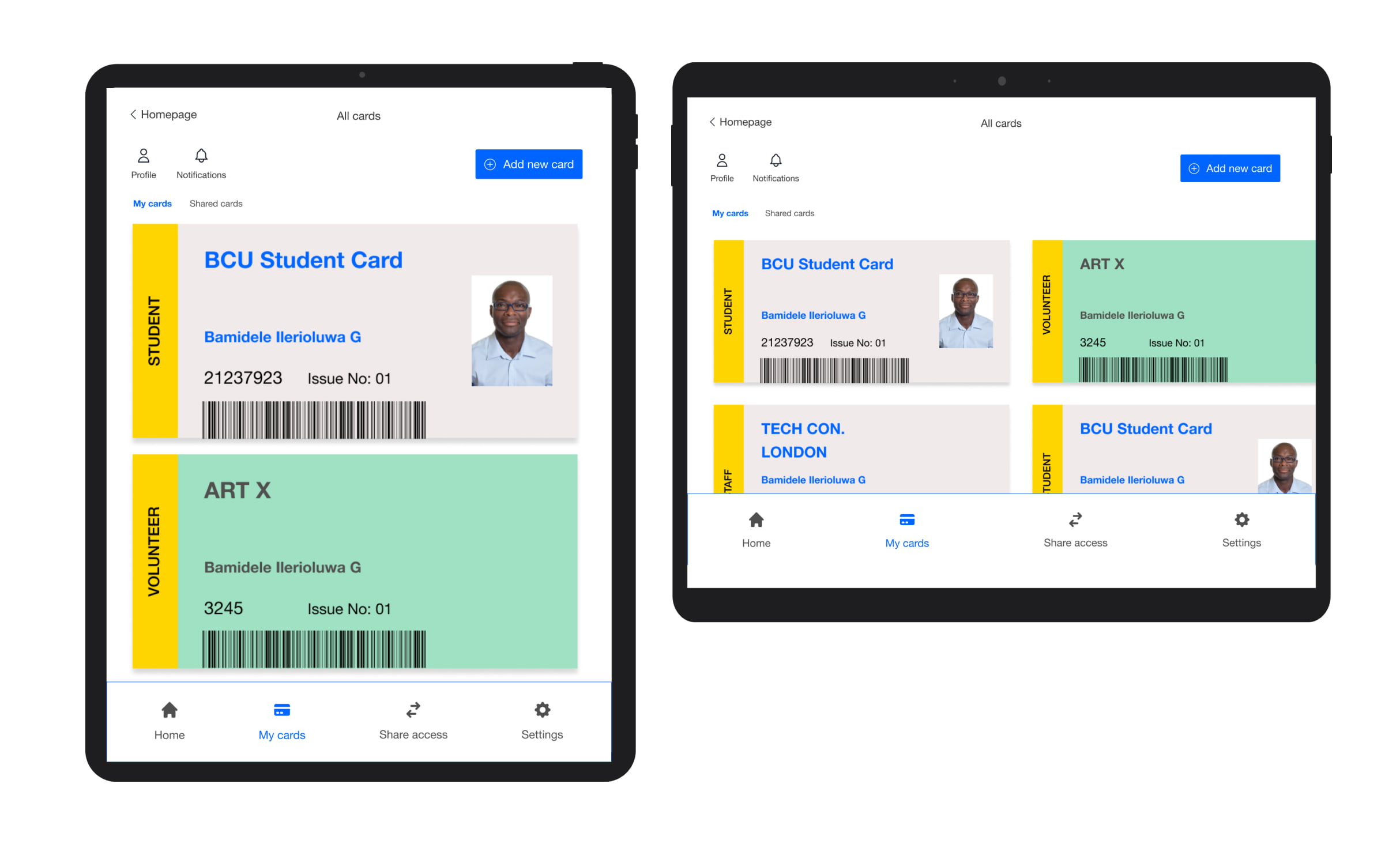
Nowadays, handheld devices are more widespread than desktop or laptop computers. In Tunisia, over 14 million mobile and handheld devices for 11 million citizens exist. There is a need for to design for multi-platform accessibility. For efficiency, there is need to state how ScanAccess will be used on multi-platform; for mobile and tablet devices, the full app functions can be used but for a smartwatch, the functionality is limited to card scanning at entry/exit points and notifications.
To ensure that ScanAcess is accessible on mobile devices, smartwatch, and tablet devices, a number of accessibility standards such as text presentation, colour contrast, control labelling, descriptions and page titles were considered.
Since the design was mobile-first, it helps to easily design for tablet without fear of information overload as seen below.
There was need to make sure that users can use the app no matter which orientation they preferred using their tablets with (WCAG 1.3.4). The information has been designed to be readable, consistent, and useful. In accordance with the WCAG 3.2.3 consistent navigation, repeated navigational elements on different devices should be consistent throughout all screens.
To help users comprehend and anticipate where various page elements will be on different screens, we made sure that navigation structure, labels and styling, and overall appearance is consistent across all screens and platforms (WCAG 3.2.3 consistent navigation).
Also, by providing predictable and consistent identification, (WCAG 3.2.4), we ensure that assets with the same functionality are recognised across all screens by using labels and instructions.
The Refinement
Testing With Users
By combining task-based scenarios and cognitive walkthroughs, with post-interview questions, this methodology balances the usability tests with feedbacks
Pilot Testing
The first issue was that both participants found the font of choice weird, even though they could both use the app, when asked about the font, they both said that it look irregular, as they would prefer something regular. The font was changed to Helvetica after the pilot testing, this way, the font became regular and not weird and not distracting.
The second issue is that while walking the participants through the process of how to use the card, they got lost in the introduction and became confused as to what exactly they needed to do. To eliminate this complexity the cognitive walkthrough was crafted in a better way, a story-like method was used to make everyone familiar with access cards and how to use them.
Main test
Result 1
Customizing Typography
Participant 3 mentioned that “Having the ability to switch from Helvetica to a more dyslexic-friendly typeface shows that proper thoughts have been given to the design process”.
Participant 8 said “I love how playful the other font is (Irregular), I do not like to be serious”.
Participant 22 said “I do not think I want to change my font but knowing that I can change it if I want or need to is really nice”.
Participants mentioned that it would be nice to have more than 2 typefaces to choose from and probably a font slider to increase the space in between letters
Result 2
Screen reader
This indicates the importance of providing options for more natural and probably customized voice settings. This feedback informs the need for ongoing improvements to meet diverse user requirements.
Result 3
Access card scanning clarity - Scan Card Feature
Participants found clarity in the pages and this was due to the fact that most of the functionality of the pages could be carried out in more than one way. The use of icons and illustrations, self explanatory buttons, among many more features
Result 4
Security and Protecting User - History Page
All participants expressed their love for the history page and the most used word to describe the feeling that the page gives is “Ease”.
Participant 3 quoted “I love this particular page because it makes me feel safe. I can track my cards and see when an unauthorized entry is made”.
Participant 7 said “I love the history feature but does this apply only to the digital cards or does it also apply to when the physical card is been used?”.
Result 5
A Dyslexic-focused Application
Most participants especially the dyslexic group, love the idea that the application is a dyslexic-focused application and loved the features that are customisable very useful.
Participant 10 referred to the application as “Mine”, and later went ahead to say “It feels like it was designed for me”.
Participant 15 said “I love the fact that the idea is tailored towards a group of people and made inclusive for the rest of the world and not the other way around.”
Participant 10 referred to the application as “Mine”, and later went ahead to say “It feels like it was designed for me”.
Project takeaways
Designing for users empower them
ScanAccess demonstrates that a user-friendly and inclusive digital access card application is practical and possible., particularly for individuals with dyslexia. ScanAccess, as a dyslexic-focused application, earned praises for its customisation features that empower users to tailor the interface to their preferences.
Enhancing security with a keyless approach
The application's potential to enhance security through the history page resonated positively with participants, providing a sense of ease and control over their access cards.
Accessible to all, not a few
ScanAccess stands as a testament to the transformative power of accessible design, paving the way for a more inclusive digital landscape.

