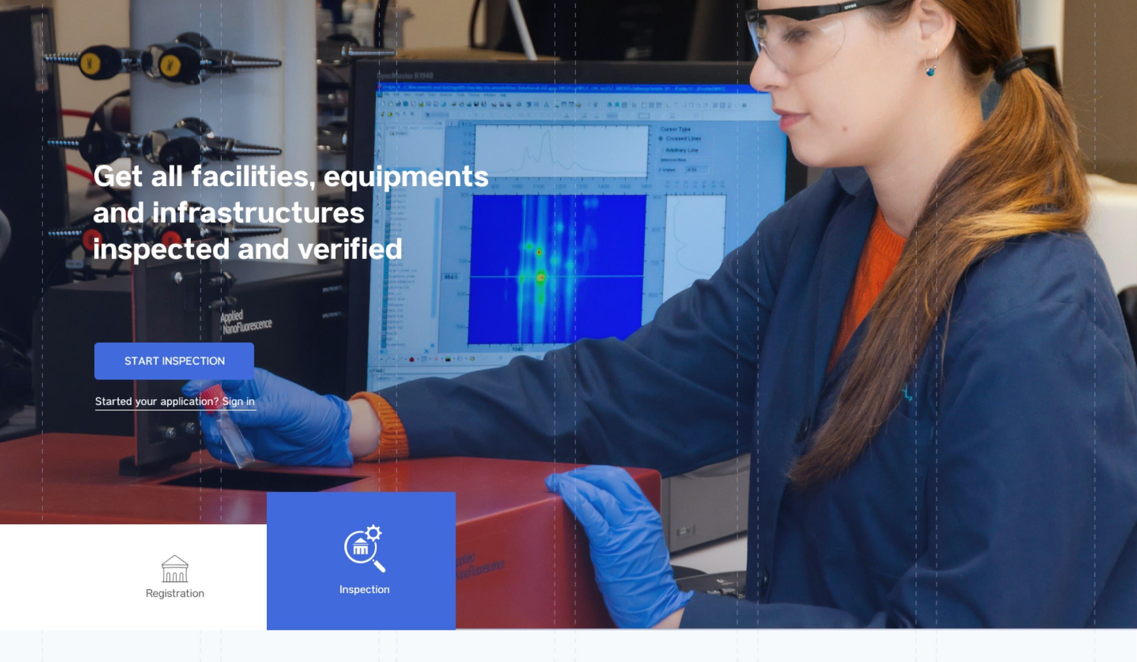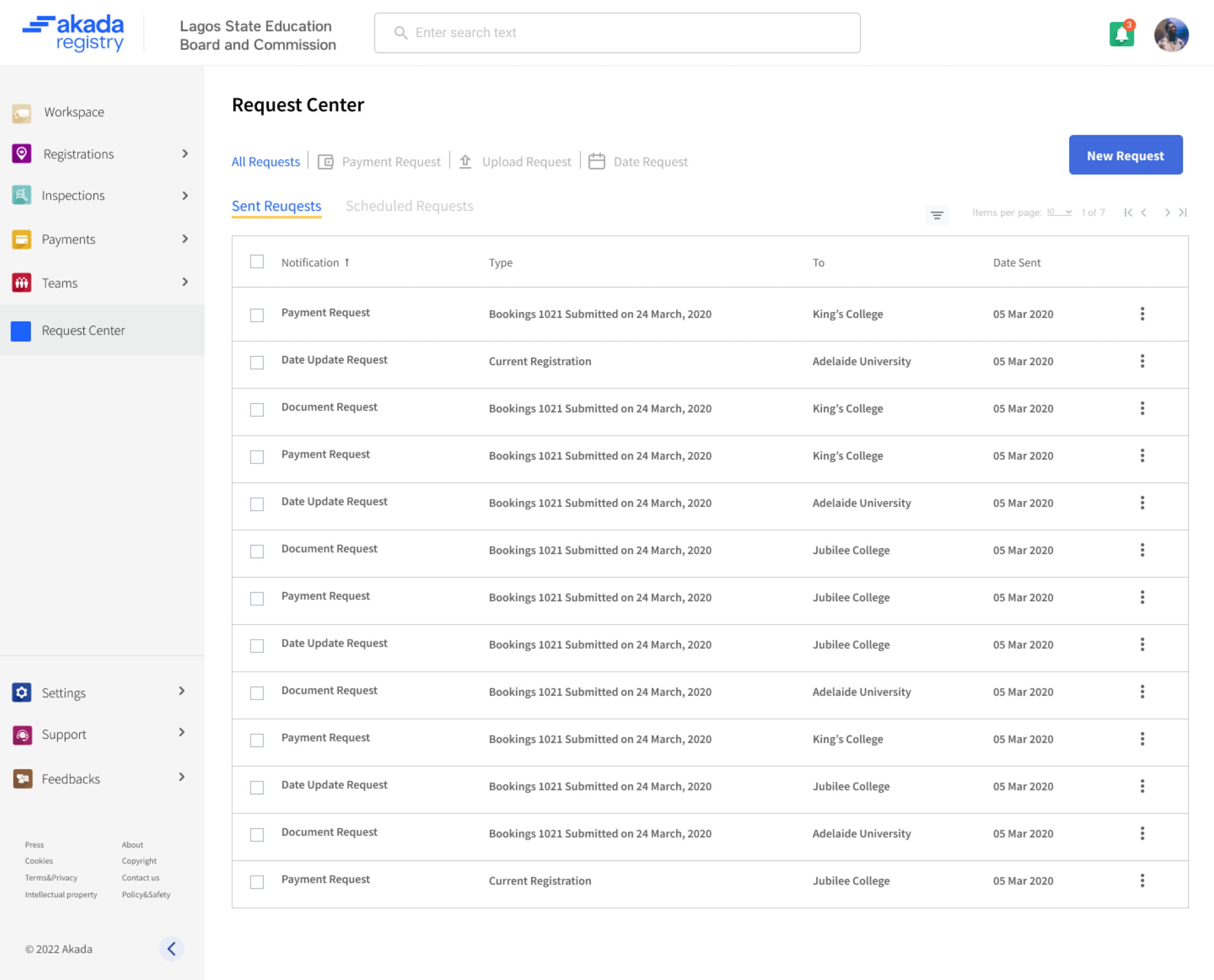
Akada Registry just the name suggests is about registration but tailored towards education institutions or how we ( the team members), love to call it, learning institutions.
Registration of any kind, either with a private body or governmental body is a total disaster due to lack of adequate information, compiled stress, and many more factors. This discourage alot of people to even start this vigorous process at all.
For the educational sector, especially in Nigeria, which is one of the first countries that akada Registry looks to launch, this problem is much worse.
After applying to register a facility, there is always need for the policy makers or government bodies to inspect this facilities, do regular check-up, just to see if what was submitted is what is actually working.
Government bodies rarely keeps such records here in Africa and even when kept, it is not easily accessible by the government bodies or agencies and their clients and this is exactly what Akada Inspection hopes to solve.e of the first countries that akada Registry looks to launch, this problem is much worse.

Akada was a newly launched product finding a product-market fit.
Most required additional handholding to set up the profiles and account program in their brick-and-mortar stores.
Like a leaky bucket, over 80% of new stakeholders and businesses churned before their 30-day free trial ended.
Akada needed to become a fully automated, self-serve platform for everyone to support the company's growth strategy and business goals.
Primary goal: Increase conversion rate by converting trialists to paying customers
Secondary goal: Increase conversion rate by converting trialists to paying customers

Akada requires a simple registration and onboarding process to increase customer retention. The quicker they could set it up their accounts, the beter thee company's growth strategy and business goals.
Inspired by a checklist, onboarding steps definitely helped guide new users to what they should be doing next and reduce the anxiety that comes with a new product.
Showing CTA’s for all steps not only increased cognitive load, but confused users. Users also ended up clicking on the circular checkboxes which weren't clickable but only communicated progress.
Friendly welcome greetings and showing an indication of progress helped drive user behaviour.
New merchants were unfamiliar and still understanding context. Images greatly helped them picture the ecosystem better.


In hindsight, I could’ve collaborated sooner with the customer support to launch the automated way of helping users to navigate and get their accounts set up as fast as possible.
Being a self-critical designer, I tend to aim for perfection (or close to it). While it’s important in some cases, it doesn’t help when launching zero-to-one products, especially in an agile environment. I created a priority vs. urgency framework for myself which helped me and the team think about releases in an iterative manner